

In this blog, I’m tackling one of the most common paint dilemmas is Agreeable Gray warm or cool?
If you’ve ever stood in a paint aisle, staring at swatches and second-guessing your choice, you’re not alone. Agreeable Gray by Sherwin-Williams is often praised as the ultimate neutral, but does it lean warm and inviting, or does it have cool undertones that give it a crisp, modern feel?
Let’s dive in.
What is Agreeable Gray?
Agreeable Gray is a greige (gray + beige) paint color that blends both warm and cool tones to create a balanced, adaptable shade.
Unlike a traditional gray, which often leans cool, or a classic beige, which can feel too warm, Agreeable Gray sits comfortably in between.
This balance is what makes it such a popular choice for homeowners looking for a color that works in almost any space.
The beauty of Agreeable Gray lies in its subtle warmth.
While it has enough gray to keep it from feeling too beige, it still carries a soft, inviting warmth that makes it feel cozy rather than stark.
This is why many homeowners and designers love using it for open-concept spaces it seamlessly connects different areas of the home without clashing with existing decor.
Is Agreeable Gray Warm or Cool?
Agreeable Gray is technically a warm gray, but it has just enough gray to keep it from feeling too warm.
This unique balance makes it one of the most flexible neutrals available.
It can appear warmer or cooler depending on factors like lighting, surrounding colors, and the direction of natural light entering the room.
In south-facing rooms, where natural light is abundant and warm, Agreeable Gray leans toward the warmer side, allowing its beige undertones to become more prominent.
In north-facing rooms, where cooler light dominates, the gray tones take center stage, making the color appear cooler and slightly more muted.
In rooms with mixed lighting, it maintains its classic greige appearance, making it neither too warm nor too cool.
This adaptability is what makes Agreeable Gray a chameleon color. It adjusts based on its environment, ensuring that it never feels too stark or too overwhelming.
Whether you prefer a cozy and inviting space or a modern and airy feel, this shade can work for both.
Agreeable Grays Undertones
Undertones play a crucial role in how a paint color appears in different settings, and Agreeable Gray is no exception.
This shade carries soft beige and subtle green undertones, which can shift depending on the rooms lighting and surrounding colors.
In bright, warm lighting, the beige undertones become more pronounced, giving the paint a cozier and more inviting feel.
This is especially noticeable in spaces with a lot of natural sunlight, where the warmth of the light enhances the beige side of the color.
On the other hand, in cooler lighting conditions, the gray tones take precedence, and sometimes a faint green undertone may emerge.
This is particularly common in north-facing rooms, where the lack of direct sunlight gives the color a cooler, more subdued appearance.
How Lighting Affects Agreeable Gray
Lighting is one of the biggest factors that determine whether Agreeable Gray appears warm or cool in a room. Different light sources and directions can significantly impact how the color is perceived throughout the day.
In north-facing rooms, where the light is naturally cooler and slightly bluish, Agreeable Gray tends to lean more gray.
The beige undertones are less pronounced, and the color takes on a more neutral, slightly cool appearance. This makes it a great option for homeowners who want a soft gray without it feeling too cold.
In south-facing rooms, which receive warm, golden sunlight throughout the day, Agreeable Gray appears warmer and more beige.
The extra warmth in the natural light enhances the cozy, inviting feel of the color, making it a great choice for spaces where you want a welcoming and relaxed atmosphere.
Because lighting can drastically change how this color looks, it’s essential to observe it at different times of the day to ensure it gives you the effect you want in your space.
Where to Use Agreeable Gray in Your Home
One of the reasons Agreeable Gray remains a top choice among homeowners is its incredible versatility. This color works beautifully in almost every room, creating a sophisticated and timeless look.
In living rooms, it provides a soft and neutral backdrop that complements various dcor styles.
Whether your furniture and accents lean toward warm earth tones or cool blues and grays, Agreeable Gray can tie everything together effortlessly.
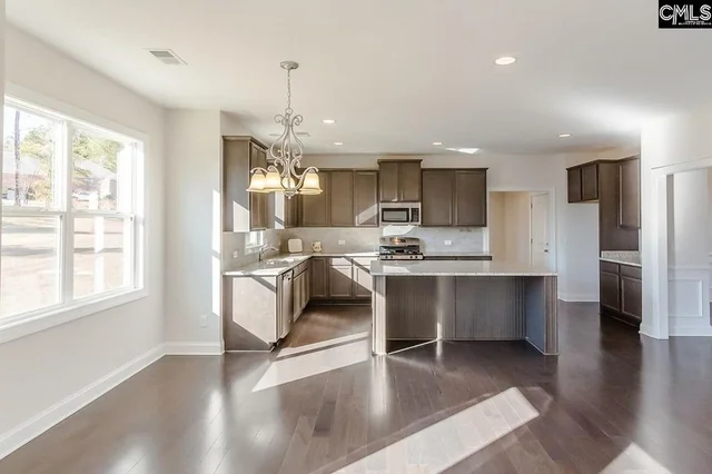
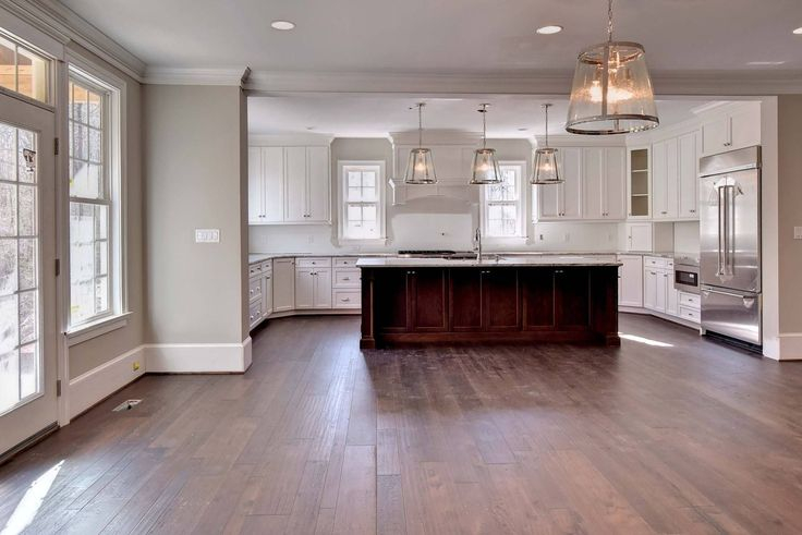
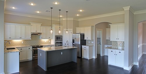
In kitchens, this shade pairs well with both white and wood cabinetry, creating a balanced and elegant look.
It also works beautifully with a variety of countertop materials, including quartz, marble, and butcher block.
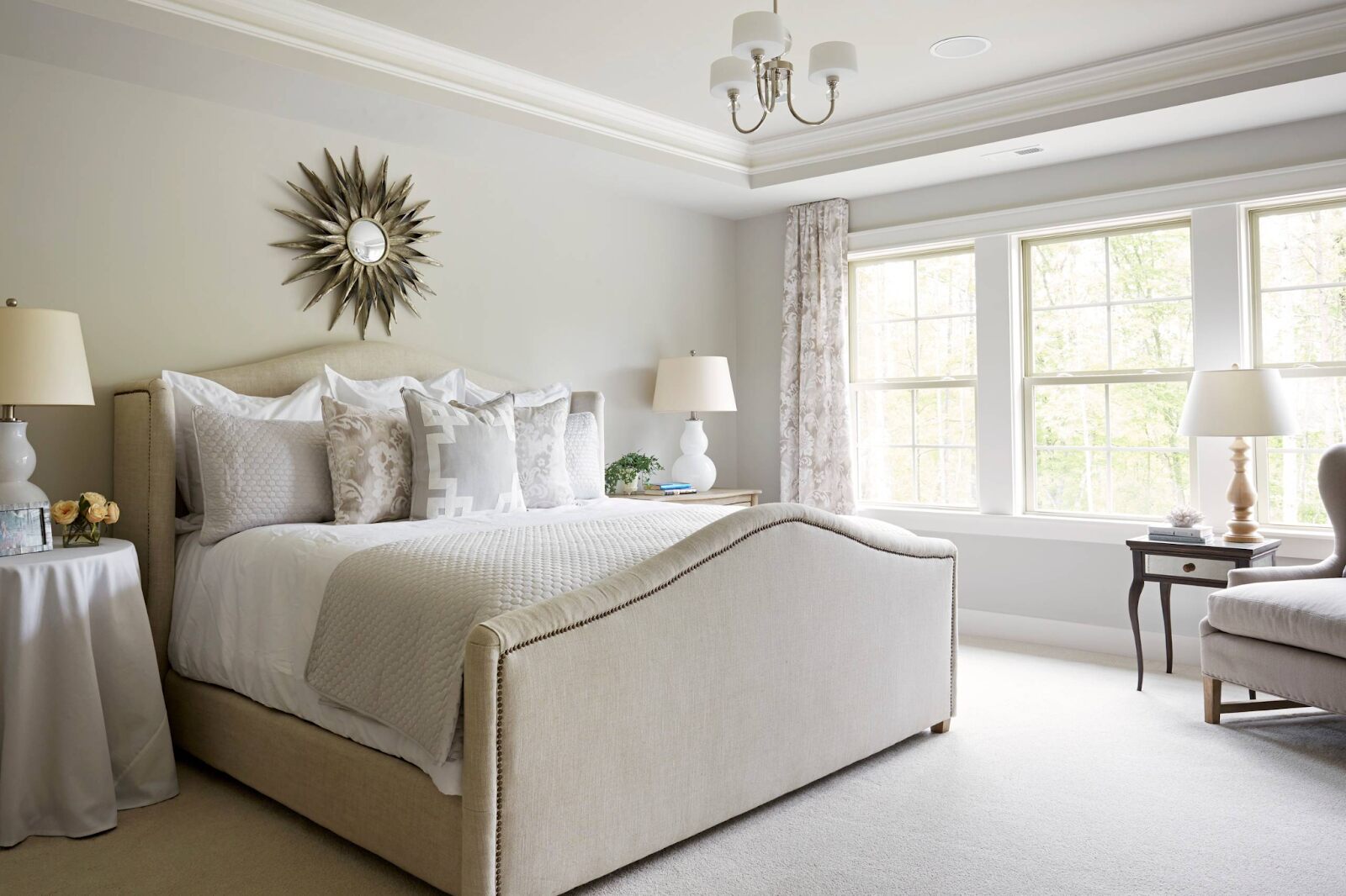
For bedrooms, Agreeable Gray is an excellent choice if you want a color that promotes relaxation.
It’s warm enough to feel cozy but neutral enough to work with both modern and traditional furnishings.
In bathrooms, this shade provides a spa-like feel, especially when paired with white trim and soft, natural elements like wood or stone.
Even for exterior applications, Agreeable Gray looks stunning with white trim and black accents, creating a timeless and elegant curb appeal.
How Agreeable Gray Compares to Other Neutrals
With so many neutral paint colors available, it’s helpful to compare Agreeable Gray to other popular options to understand its unique characteristics.
When compared to Repose Gray, another popular Sherwin-Williams gray, Agreeable Gray is slightly warmer. Repose Gray has more cool undertones, making it a better choice for spaces where you want a crisp, modern look.
In contrast to Accessible Beige, which is a true beige with slight gray undertones, Agreeable Gray leans more gray. If you prefer a color that feels a little less warm, Agreeable Gray is the better option.
Against Edge comb Gray by Benjamin Moore, Agreeable Gray appears slightly cooler and grayer, whereas Edge comb Gray has stronger beige undertones, making it feel warmer in most spaces.
Conclusion
If you’re looking for a versatile, neutral paint color that adapts well to different lighting conditions and complements a variety of decor styles, Agreeable Gray is an excellent choice. Its balanced blend of warmth and coolness makes it a great option for open-concept homes, individual rooms, and even exteriors. The key to making Agreeable Gray work for your home is understanding how lighting and surrounding colors affect its appearance.
FAQs
Does Agreeable Gray look more gray or beige?
Its a balanced greige, but its appearance depends on lighting. In bright, warm light, it leans beige, while in cooler lighting, it looks more gray.
Will Agreeable Gray make my room look cold?
No, it has warm undertones that keep it from feeling too cold. However, in north-facing rooms, it may appear slightly cooler.
Is Agreeable Gray a good choice for open-concept homes?
Absolutely! Its neutral tone blends well with different rooms and decor styles, making it perfect for open floor plans.
What colors go best with Agreeable Gray?
It pairs beautifully with crisp whites, warm wood tones, and accent colors like navy, soft greens, and charcoal.
Can I use Agreeable Gray for exterior paint?
Yes! It looks stunning with white trim and black accents, creating a timeless, sophisticated curb appeal.