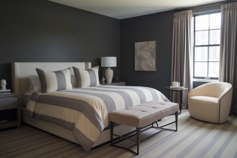
In this blog, I’ll share why Benjamin Moore Kendall Charcoal (HC-166) is a go-to choice for designers. This deep, rich gray is both bold and versatile, fitting effortlessly into modern, traditional, and rustic spaces. It brings warmth while maintaining a sophisticated, timeless appeal.
Kendall Charcoal adds depth and drama to walls, cabinets, and accent pieces. It pairs beautifully with white trim, natural wood, and brass fixtures, creating a stylish yet cozy atmosphere. Depending on the lighting, it can feel moody and bold in dim spaces or soft and refined in bright areas.
This striking gray enhances siding, shutters, and doors, working seamlessly with stone, brick, and warm wood tones. It delivers instant curb appeal while staying elegant and understated. Whether you’re revamping a room or refreshing your home’s facade, Kendall Charcoal is a fail-proof, designer-approved choice.
Understanding Kendall Charcoal
- Light Reflectance Value (LRV): 13
- RGB Values: 99, 99, 92
- VOC (Volatile Organic Compounds): Low
Kendall Charcoal (HC-166) by Benjamin Moore is a deep gray-black with subtle green undertones. This balance gives it a rich, grounded feel that works in both modern and classic spaces.
Its ability to adapt to different settings makes it a go-to neutral for designers. Kendall Charcoal shifts in tone based on lighting. In bright natural light, it appears softer and slightly warmer.
In darker spaces, its green undertones emerge, making it feel cozier. Whether you use it on walls, cabinetry, or exteriors, its depth and versatility make it a timeless choice.
Best Color Pairings for Kendall Charcoal
Crisp Whites & Soft Neutrals
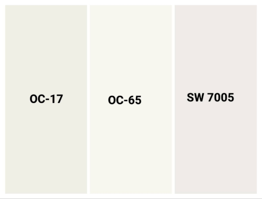
Best White Trim Colors
- Benjamin Moore White Dove (OC-17)
- Benjamin Moore Chantilly Lace (OC-65)
- Sherwin-Williams Pure White (SW 7005)
You can pair Kendall Charcoal with crisp whites and soft neutrals creates a timeless, balanced look. White trim enhances its depth, making spaces feel refined and structured. Choosing the right white ensures a clean, elegant contrast that highlights Kendall Charcoal’s richness.
Benjamin Moore White Dove is a warm, soft white that blends effortlessly with Kendall Charcoal. Ideal for trim, ceilings, and cabinets. Benjamin Moore Chantilly Lace is a bright, true white that adds sharp contrast, making Kendall Charcoal stand out.
Sherwin-Williams Pure White is a versatile, neutral white that complements both warm and cool tones. These whites create clean, crisp edges without overwhelming the space. Whether on walls, cabinetry, or exteriors, these pairings ensure a sophisticated and well-balanced design
Neutral Wall & Furniture Pairings:
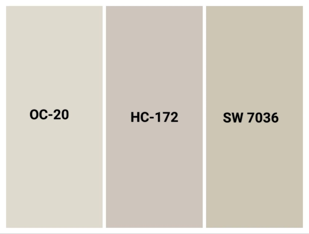
- Pale Oak (OC-20)
- Revere Pewter (HC-172)
- Accessible Beige (SW 7036)
You can pair Kendall Charcoal with soft neutrals creates a balanced, inviting space. Light, warm-toned neutrals keep the room from feeling too dark and add a sense of openness. Whether on walls or furniture, these shades complement Kendall Charcoal without competing for attention.
Pale Oak is a light taupe-gray with a soft, airy feel. It provides a gentle contrast to Kendall Charcoal without overpowering it. Use it for walls, large furniture pieces, or open spaces to keep the room feeling bright and spacious.
Revere Pewter is a classic warm gray that blends warm and cool tones. It creates a smooth transition between Kendall Charcoal and lighter design elements. It’s perfect for walls in open-concept areas, built-in shelving, or trim to add warmth without looking too beige.
Accessible Beige is a warm beige with subtle gray undertones, making it a versatile neutral. It softens the boldness of Kendall Charcoal while maintaining depth in the space. Use it for upholstered furniture, rugs, or accent walls to add warmth and texture.
Earthy & Natural Tones
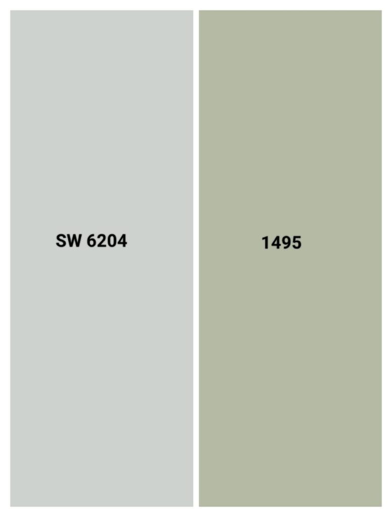
Soft Greens & Blues:
- Sherwin-Williams Sea Salt (SW 6204)
- Benjamin Moore October Mist (1495)
Soft greens and blues bring a calming, organic touch to Kendall Charcoal. These colors enhance its depth while adding a sense of freshness. Whether on walls, furniture, or decor, they create a balanced and inviting space.
Sherwin-Williams Sea Salt is a soft green-blue with a muted, spa-like feel. It pairs beautifully with Kendall Charcoal, lightening the space while maintaining a sophisticated look. Use it for walls in bedrooms, bathrooms, or kitchens to create a relaxing atmosphere.
Benjamin Moore October Mist is a muted sage green with subtle warmth. It blends seamlessly with Kendall Charcoal, adding an earthy, natural element. It works well on walls, cabinets, and accent decor, bringing warmth and softness to any room.
Bold & Dramatic Pairings
Deep, Saturated Colors:
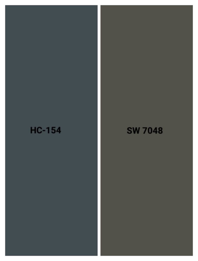
- Benjamin Moore Hale Navy (HC-154)
- Sherwin-Williams Urbane Bronze (SW 7048)
Deep, saturated colors create a strong, sophisticated contrast with Kendall Charcoal. These pairings add depth and dimension, making the space feel intentional and stylish. If you want a bold statement, these colors are excellent choices.
Benjamin Moore Hale Navy is a rich, classic navy that enhances Kendall Charcoal’s depth. The combination creates a moody, elegant atmosphere perfect for walls, cabinetry, or accent pieces in offices, dining rooms, or bedrooms.
Sherwin-Williams Urbane Bronze is a deep brown-black with warm undertones. It blends beautifully with Kendall Charcoal, adding a layer of richness and sophistication. Use it for doors, furniture, or feature walls to create a dramatic, refined look.
Kendall Charcoal in Interior Design
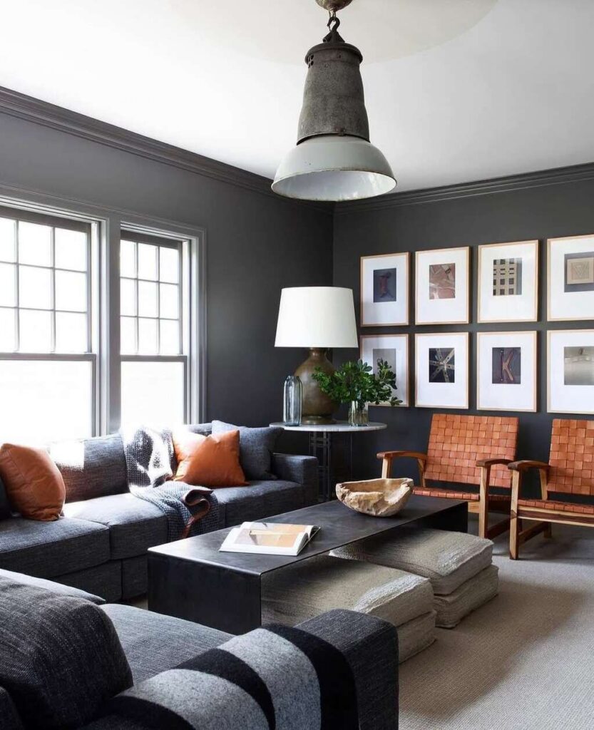
Kendall Charcoal adds depth and sophistication to any space. Its versatility allows it to pair effortlessly with neutral tones, warm wood, and crisp whites. Whether you prefer a cozy retreat or a bold statement, this rich gray adapts beautifully to different styles.
In living and dining rooms, it creates a moody yet inviting atmosphere, pairing well with neutral sofas, white curtains, and wood accents. White wainscoting and statement lighting enhance its elegant, timeless feel, while mixed-material furniture like wood and metal add contrast and texture.
For bedrooms and kitchens, Kendall Charcoal brings warmth and balance. It works beautifully with sage green, warm wood, and soft textures, creating a calm and relaxing retreat.
In kitchens, it shines on cabinets, especially when paired with white quartz, marble, or natural wood backsplashes. Brass or matte black hardware completes the modern, refined look.
Kendall Charcoal for Exterior Design
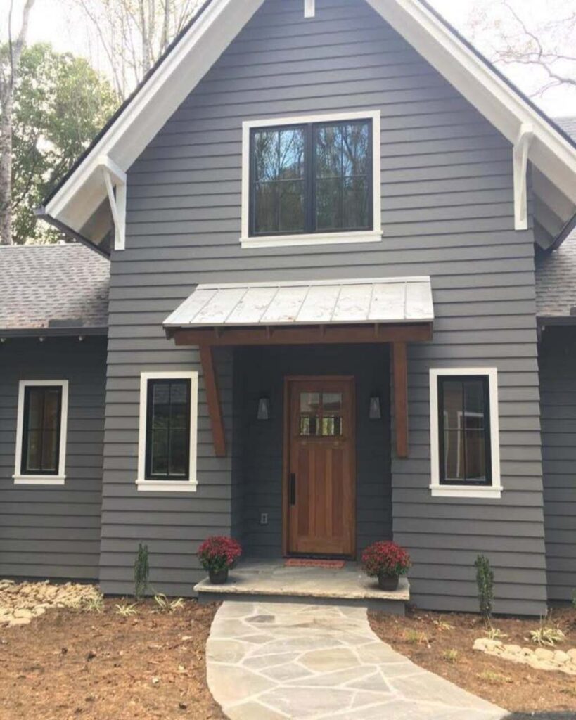
Kendall Charcoal adds depth and elegance to any exterior. It pairs beautifully with light trim colors like Swiss Coffee and Simply White, creating a crisp contrast.
For a modern touch, black or deep green shutters enhance its richness.
Wood accents, such as doors, soffits, and porch columns, bring warmth and balance to its bold tone.
You can add landscaping elements like deep-green shrubs (boxwoods, junipers) further highlight its undertones. Natural stone features, including retaining walls and pathways, add texture and depth, making Kendall Charcoal a sophisticated and timeless choice for exteriors.
Common Mistakes to Avoid When Pairing Kendall Charcoal
One of the biggest mistakes is overusing dark colors, which can make a space feel heavy and unbalanced. While Kendall Charcoal pairs well with deep hues, too many dark elements can create a closed-in look. To maintain contrast, incorporate light neutrals, crisp whites, or warm wood tones for balance.
Another mistake is choosing cool-toned grays that clash with Kendall Charcoal’s subtle warmth. Stick to warm grays, soft beiges, or earthy greens for a cohesive palette. Also, consider lighting conditions before committing—this color can look dramatically different in natural vs. artificial light. Always test swatches in various lighting to ensure the right look.
FAQ
How does Kendall Charcoal compare to other dark grays?
It is warmer than Sherwin-Williams Peppercorn and darker than Benjamin Moore Chelsea Gray, making it a balanced deep gray.
What type of flooring pairs well with Kendall Charcoal?
Light or medium-toned hardwood, natural stone, and warm-toned tile complement its richness.
Is Kendall Charcoal a good choice for a front door?
It makes a bold yet inviting statement, especially when paired with light siding and warm wood or metal hardware.
What hardware finishes complement Kendall Charcoal cabinetry?
Brass, matte black, and brushed nickel enhance its elegance and contrast.
Conclusion
Kendall Charcoal pairs beautifully with crisp whites, soft neutrals, earthy greens, and deep, bold tones. Light trims like Swiss Coffee and Simply White create contrast, while warm neutrals such as Pale Oak and Revere Pewter add balance. For a bolder look, Hale Navy and Urbane Bronze enhance its depth, and wood accents bring warmth both indoors and outdoors.
Before finalizing your palette, always sample colors in different lighting. Natural and artificial light can shift how Kendall Charcoal appears, influencing the overall mood of your space. Testing swatches on walls, cabinets, or exteriors ensures a harmonious and well-balanced design that fits your style.

