

In this blog, I’ll compare Sherwin Williams Shoji White vs Alabaster to help you choose the one that will bring your vision to life.
Two popular choices from Sherwin Williams—Shoji White and Alabaster—often leave homeowners torn between their subtle differences. Should you go for a warmer, slightly deeper hue, or the soft, serene simplicity of a lighter tone? If you’re struggling to decide which one fits your style and space, I’ll help you out.
Keep reading to find the perfect white for your next project.
Shoji White (SW 7042)
Shoji White is a soft, warm white with just a hint of gray. It’s a versatile color that works well in both traditional and modern spaces.
What sets Shoji White apart is its calming, neutral vibe, which gives it an almost creamy, sophisticated feel without being overpowering.
The subtle gray undertones add depth and richness, making it an ideal choice for spaces that need warmth but don’t want to feel too yellow or beige.
Alabaster (SW 7008)
Alabaster is one of Sherwin William’s most popular whites for a reason.
It’s a soft, warm white with a gentle, almost ivory-like quality that brings a sense of elegance and purity to any room.
The undertones in Alabaster lean slightly towards a soft cream, giving it a welcoming, cozy feel without being too yellow.
It’s a truly timeless white, making it a go-to for everything from walls and ceilings to cabinetry and trim.
Comparing Shoji White and Alabaster
Here’s a quick comparison between Shoji White and Alabaster in a table format:
|
Aspect |
Shoji White |
Alabaster |
|
Product Code |
SW 7042 |
SW 7008 |
|
RGB |
(221, 213, 199) |
(242, 234, 224) |
|
Hex |
#DDD5C7 |
#F2EAE0 |
|
Undertones |
Warm beige with gray hints |
Warm creamy with slight yellow undertones |
|
Light Reflectance Value (LRV) |
74 |
82 |
|
Best for |
Living rooms, bedrooms, and cozy spaces |
Kitchens, bathrooms, and light-filled areas |
|
Feel |
Soft, calming warmth |
Bright, airy, and fresh |
Comparing LRVs
Shoji White has an LRV of 74, which means it reflects a moderate amount of light. It’s a soft, warm white that still keeps things feeling cozy and inviting.
If you’re working with a room that doesn’t get a ton of natural light, Shoji White could be a great option.
Now, let’s talk about facing. If your room faces north—where light tends to be cooler and more diffused—Shoji White can warm things up.
The warmer undertones in the red and green will help offset the cooler light, giving your space a more inviting, balanced vibe.
However, if your room faces south or west, where the light tends to be stronger and warmer, you might find that Shoji White looks a little too warm or even a bit beige at times, especially as the sun sets.
On the other hand, Alabaster has an LRV of 82, which is significantly higher.
This means it reflects more light and will make your space feel brighter, more open, and airy.
If your room faces north, Alabaster will still reflect light beautifully, but it won’t be too cool or stark.
The creamy undertones help it stay soft and fresh even in lower light, making it an excellent choice for rooms that lack natural sunlight.
However, if your room faces south or west, Alabaster will reflect the warm light coming in, enhancing its light and airy vibe. If you’re after a light, almost ethereal look, Alabaster will make the most of that sun exposure.
Comparing VOC
Shoji White typically falls into the low-VOC category. This means that Shijo White contains less than 50 grams of VOCs per liter for interior use, which is the standard for low-VOC paints.
Like Shoji White, Sherwin-Williams keeps their VOC levels for Alabaster below 50 grams per liter for their interior paints, which is in line with industry standards for paints labeled as “low-VOC.”
Comparing RGB
Shoji White (RGB: 221, 213, 199)
Shoji White has a subtle blend of 221 (red), 213 (green), and 199 (blue) in its composition.
The slightly deeper tone (thanks to its gray undertones) helps it maintain its warmth without feeling too stark, and it still reflects enough light to keep the space from feeling too dim.
It’s perfect if you’re looking for a balance—bright but not overwhelming, warm but still fresh.
Alabaster (RGB: 242, 234, 224)
Alabaster, on the other hand, has 242 (red), 234 (green), and 224 (blue) in its makeup, making it a slightly lighter and creamier white with less depth than Shoji White.
If you’ve got a small or darker room that could use a little extra lift then its light, creamy undertones give it that breezy, effortless elegance,
It’s an excellent choice if you want a fresh, clean vibe without feeling too cold or clinical.
Coordinating Colors of Shoji White
Shoji White has a bit of depth, which means it pairs beautifully with earthy, muted tones. If you’re working with this shade, you’ll want colors that play off its warmth without competing with it.
- SW Pure White 7005
- SW Pewter Green 6208
- SW Anonymous 7046
- SW Smoky Blue 7604
- SW Urbane Bronze 7048
- Repose Gray SW 7015
- Perfect Greige SW 6073
Coordinating Colors of Alabaster
Alabaster, with its lighter, creamier feel, is a bit more versatile when it comes to pairing. It blends beautifully with both warm and cool tones, so you’ve got a lot of freedom to work with.
- SW Pure White 7005
- Accessible Beige SW 7036
- Evergreen Fog SW 9130
- Black Magic SW 6991
- Stardew SW 9134
- Tradewind SW 6218
- Tarrytown Green SW 6487
Where to Use Shoji White and Alabaster?
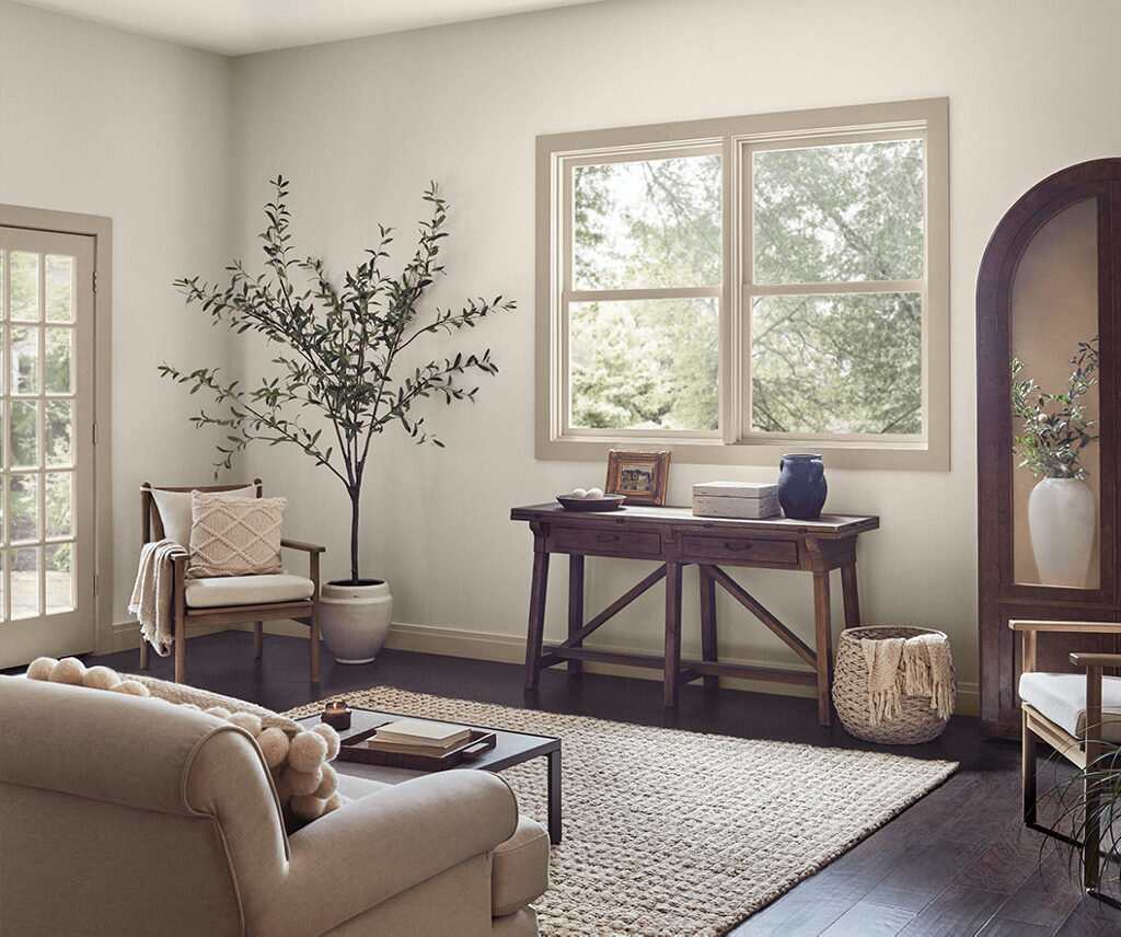
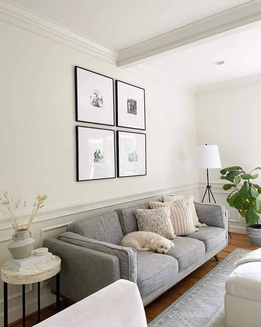
Shoji White wonders in living rooms and bedrooms, especially if you’re aiming for a cozy, relaxed feel.
It’s perfect for north-facing rooms where the light tends to be cooler and can sometimes make spaces feel a bit too cold.
I paired it with earthy tones and wooden furniture, and it created a beautiful, harmonious vibe that made the room feel grounded.
If you’re looking to create a peaceful retreat in your home, Shoji White is an excellent choice for spaces like home offices or reading nooks.
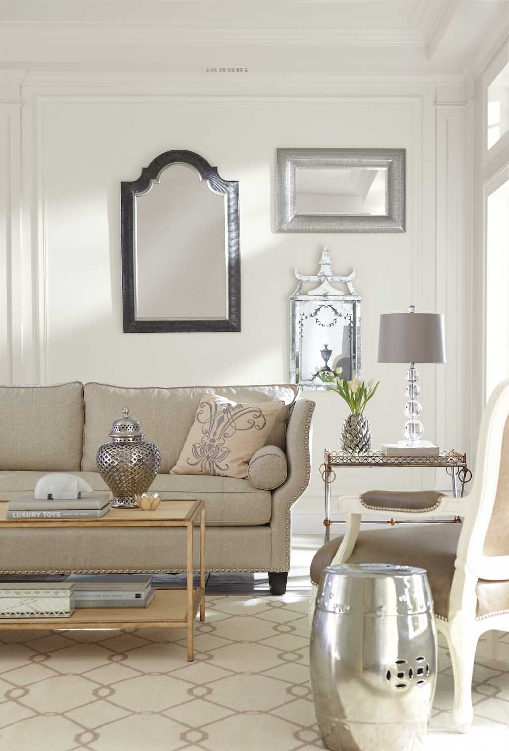
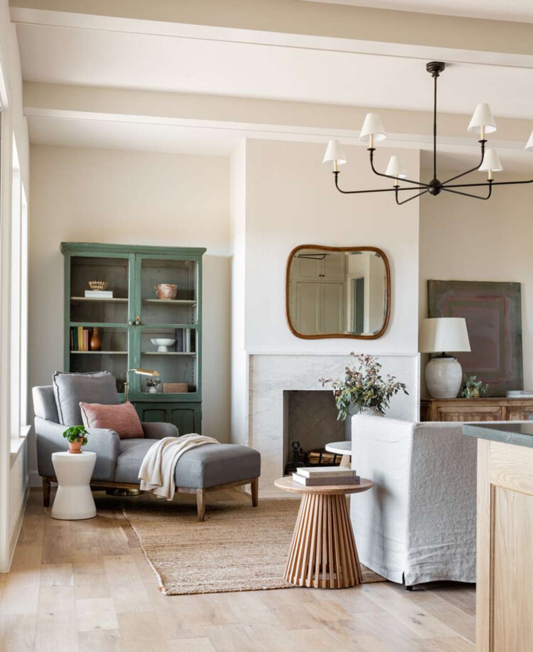
Alabaster, on the other hand, is my go-to for creating an open, bright feel in spaces like the kitchen, bathroom, or living areas that get plenty of natural light.
Its soft, creamy warmth makes it perfect for south-facing rooms, where the abundance of sunlight can make other whites feel too harsh or cold.
In my kitchen, Alabaster made the space feel more expansive and airy—just what I wanted for a bright, inviting atmosphere.
I also used it in a guest bathroom, and it gave the room a fresh, spa-like quality.
If you want a timeless, clean look that reflects light beautifully, Alabaster is an excellent choice.
Conclusion
Both Shoji White and Alabaster are excellent choices, each bringing its unique charm to your space. Shoji White is perfect for creating a cozy, grounded atmosphere, making it ideal for living rooms and bedrooms, especially in north-facing rooms where you want warmth without being too yellow.
On the other hand, Alabaster is the go-to for a bright, airy feel, especially in kitchens, bathrooms, or light-filled areas. Its creamy undertones make it timeless and versatile, reflecting light beautifully and creating an open, fresh space.
Ultimately, it depends on the vibe you want to create—Shoji White for warmth and depth or Alabaster for a light, expansive feel. Both will enhance your home’s aesthetic!
FAQs
Which color is better for a small room?
If you’re working with a small space, Alabaster is your best bet. Its higher light reflectance value (LRV) will make your room feel more open and airy. If you prefer a cozier feel, Shoji White adds depth without feeling overwhelming.
Can I pair Shoji White or Alabaster with bold colors?
Absolutely! Both colors are neutral enough to complement bold accents. Shoji White pairs well with earthy tones, greens, and blues, while Alabaster is versatile enough to blend with both warm and cool hues.
Will Shoji White or Alabaster look too yellow?
Not at all! While both have warm undertones, Shoji White has more of a beige-gray tint that keeps it balanced, while Alabaster’s creamy undertones are subtle and never overly yellow, making it a soft, timeless choice.
What type of light makes Shoji White or Alabaster look best?
Both colors have their charm, but Shoji White shines best in natural light or rooms with soft artificial lighting. The subtle gray tones will come to life and won’t feel too stark. Alabaster, on the other hand, thrives in rooms with ample natural sunlight, where its creamy undertones will bounce light around, creating a bright and airy ambiance.
If I want to create a spa-like atmosphere, which color should I use?
If you’re creating a tranquil spa retreat, Shoji White will add warmth and calmness to the room with its soft, grounded feel. For a more bright and airy, uplifting spa vibe, Alabaster is the perfect pick—it reflects light beautifully and offers a peaceful, fresh look that’s ideal for bathrooms or relaxation spaces.