

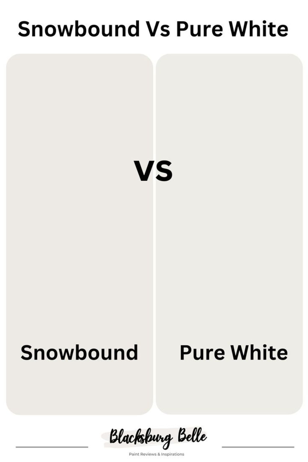
In this blog, I’m going to break down the key differences between two whites, Sherwin Williams Snowbound vs Pure White.
If you’ve been torn between Sherwin Williams Snowbound and Pure White, you’re not alone! Both are stunning choices, but they each bring something unique to the table. So, how do you decide? Should you go with the soft, almost cool vibe of Snowbound, or opt for the crisp, clean look of Pure White?
Stick with me to solve your white paint dilemma.
What is SW Snowbound?
Sherwin Williams Snowbound (SW 7004) is a soft, cool-toned white that brings a sense of calm and serenity to any room.
It has a slightly muted, almost icy quality to it, making it perfect for spaces where you want a fresh, airy feel without the harshness of a stark white.
Snowbound’s subtle undertones of gray and blue give it a cool, clean appearance, which works wonderfully in modern or contemporary interiors.
It’s an excellent choice for walls, trim, cabinetry, or ceilings, especially when paired with other cool tones or natural elements.
What is SW Pure White?
Sherwin Williams Pure White (SW 7005) is a crisp, bright white that has a touch of warmth but remains fairly neutral.
Unlike some whites with strong undertones, Pure White is versatile and works well with a wide range of colors, making it a popular choice for everything from walls and trim to cabinetry and ceilings.
It’s a great option if you’re aiming for a clean, fresh look without the coolness or warmth that some other whites carry.
Pure White has a subtle softness, giving it a welcoming and timeless appeal, making it perfect for traditional, modern, and even farmhouse-style interiors.
Comparing SW Pure White and SW Pure White
Here’s a simple comparison table between Sherwin-Williams Snowbound and Pure White:
|
Feature |
Sherwin Williams Snowbound (SW 7004) |
Sherwin Williams Pure White (SW 7005) |
|
Base Tone |
Cool, soft white with subtle gray and blue undertones. |
Neutral, balanced white with slight warmth. |
|
Brightness |
Light, but with a slightly muted, serene appearance. |
Crisp and bright with a clean, fresh vibe. |
|
Undertones |
Cool undertones, leaning toward gray and blue. |
Minimal undertones, and slight warmth, making it more neutral. |
|
Ideal Use |
Modern, contemporary spaces, trim, cabinets, ceilings. |
Versatile for almost any space, including walls, trim, and ceilings. |
|
Style Suitability |
Best for cool, minimalistic, or coastal interiors. |
Fits both modern and traditional interiors. |
|
Contrast |
Pairs well with cool-toned palettes and natural wood accents. |
Pairs well with both warm and cool-toned palettes. |
|
Room Types |
Living rooms, kitchens, bathrooms, trim, and ceilings. |
Bedrooms, living rooms, kitchens, trim, and cabinetry. |
Comparing LRVs
Snowbound has an LRV of 83, meaning it reflects 83% of light.
North-facing rooms tend to have cooler, dimmer natural light, so Snowbound’s cool undertones may make the space feel slightly more subdued or chilly.
However, with an LRV of 83, it still reflects a good amount of light, preventing the room from feeling too dark.
South-facing rooms receive abundant natural light throughout the day, making Snowbound’s cool tones feel more balanced.
The warmth from the sunlight helps counteract the color’s cooler undertones, creating a serene, almost ethereal quality.
Pure White has a slightly higher LRV of 84, which means it reflects a bit more light than Snowbound.
In north-facing rooms, Pure White will feel more inviting than Snowbound, thanks to its higher LRV and slightly warmer undertones. It will reflect more of the natural light, making the room feel brighter and more open.
In south-facing rooms, Pure White will truly shine. The abundant natural light will enhance its crisp, clean look, making the space feel fresh and airy.
Because it has a neutral balance of warmth and coolness, it can handle the bright sunlight without becoming too warm or too cool, maintaining its bright and cheerful feel all day long.
Comparing RGB
Sherwin Williams Snowbound (SW 7004) has an RGB value of Red: 232, Green: 230, Blue: 224. The slightly higher blue value gives it a cool, subtle undertone that leans toward a blue-gray tint.
On the other hand, Sherwin Williams Pure White (SW 7005) has an RGB value of Red: 242, Green: 241, Blue: 236. The higher red and green values in Pure White give it a warmer, more neutral base compared to Snowbound.
The key difference between the two lies in the undertones and overall warmth. Snowbound’s higher blue value leans toward a cooler, muted look, perfect for spaces where you want to create a serene, modern feel.
In contrast, Pure White’s balanced mix of red, green, and blue gives it a brighter, cleaner look with a bit more warmth, making it suitable for any room orientation and providing a crisp, airy vibe throughout.
Coordinating colors
When it comes to coordinating colors with Sherwin Williams Snowbound (SW 7004) and Pure White (SW 7005), understanding their undertones and overall vibe can help you choose complementary or contrasting shades that work beautifully in your space.
Coordinating Colors for Snowbound (SW 7004)
- Silver Strand (SW 7057)
- Repose Gray (SW 7015)
- Sea Salt (SW 6204)
- Aesthetic White (SW 7035)
- Gale Force (SW 7605)
Coordinating Colors for Pure White (SW 7005)
- Alabaster (SW 7008)
- Repose Gray (SW 7015)
- Mindful Gray (SW 7016)
- Accessible Beige (SW 7036)
- Naval (SW 6244)
Where to use these two colors?
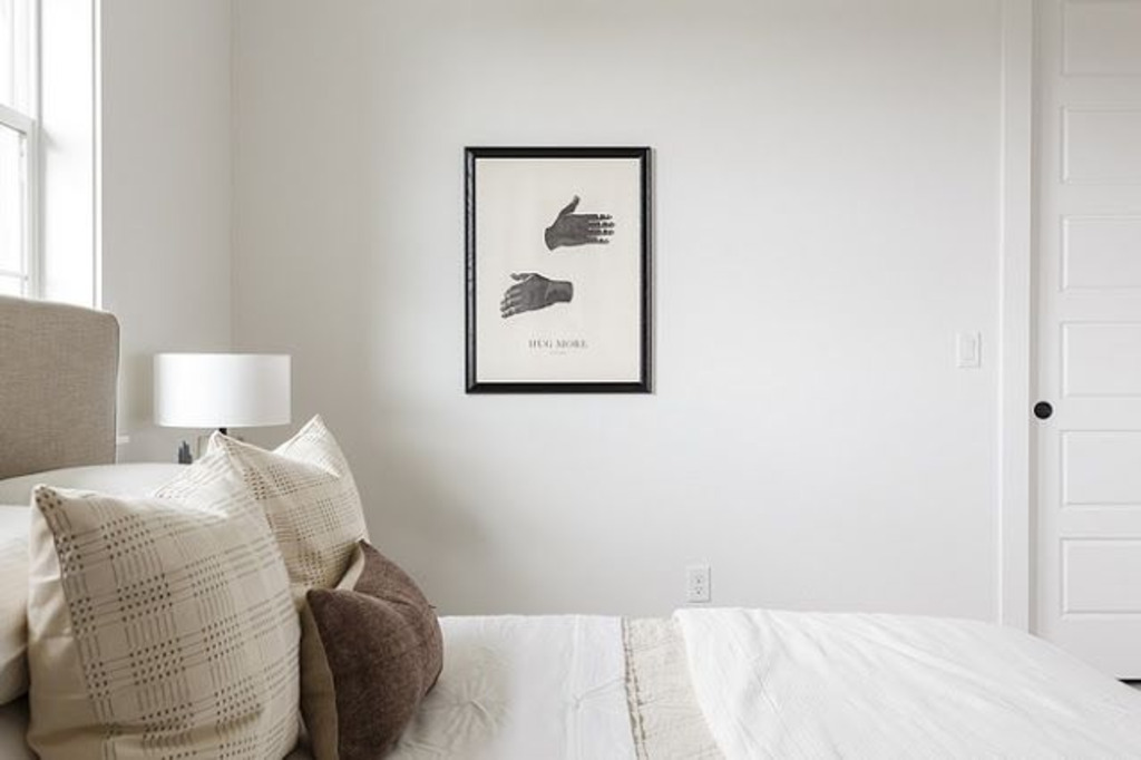
When I tried Sherwin Williams Snowbound (SW 7004) in my home, I immediately noticed how it created a serene, calming atmosphere.
I’d highly recommend using Snowbound in bathrooms or bedrooms where you want a peaceful retreat.
It’s also a fantastic choice for kitchen cabinets or trim work, as it provides a crisp yet understated backdrop to any design style.
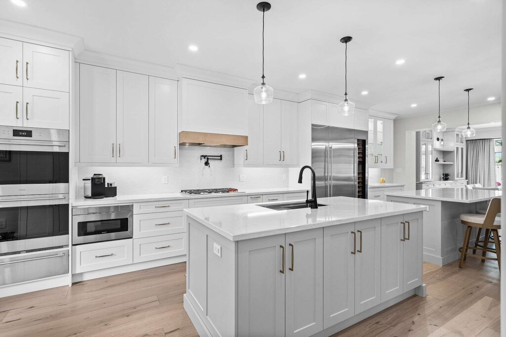
If you’re looking for a more versatile and warmer option, Pure White (SW 7005) is another fantastic color I’ve personally used and loved.
Its clean, neutral tone with just a hint of warmth makes it perfect for living rooms or open-concept areas where you want to maintain a bright, airy feel.
Pure White is also great for ceilings or walls in entryways, giving a welcoming first impression.
I’ve found it works especially well in spaces that need to feel fresh and open, like hallways or even laundry rooms.
If you want a clean, timeless feel, both are excellent choices – it just depends on whether you lean more toward a cool or warm ambiance.
Conclusion
In conclusion, both Sherwin Williams Snowbound (SW 7004) and Sherwin Williams Pure White (SW 7005) are exceptional whites, but they each bring something unique to your home.
Snowbound’s cool, calming undertones create a serene atmosphere, making it ideal for modern and minimalist spaces. Its subtle, icy vibe works wonders in bedrooms, bathrooms, and areas where you want to bring in a peaceful retreat.
On the other hand, Pure White offers a crisper, brighter tone with a touch of warmth, making it perfect for nearly every room. It adapts well to both modern and traditional styles, ensuring a clean, inviting feel wherever it’s used.
FAQs
Can I use Snowbound and Pure White together?
Absolutely! Both colors can work harmoniously in different areas of your home. Consider using Snowbound for accent walls or trim, and Pure White for larger spaces or ceilings to create a balanced, cohesive look.
How do I decide between Snowbound and Pure White for my home?
If you want a cool, modern vibe, go for Snowbound. For a brighter, neutral option that works in any room, Pure White is the perfect choice.
Which white is best for trim and cabinetry?
Both Snowbound and Pure White are great choices for trim and cabinetry. Snowbound offers a soft, clean look, while Pure White provides a brighter, crisper finish. It depends on whether you want a cooler or warmer aesthetic.
Which color is better for small rooms?
Both colors are great for small rooms, but Pure White’s higher LRV (84) reflects more light, making it a better option if you want the room to feel open and airy.
Can Snowbound be used in a dark room?
Yes! Snowbound’s LRV of 83 reflects light well, so it works in spaces with limited natural light. Its cool tones help keep the space feeling fresh without being too dark.