

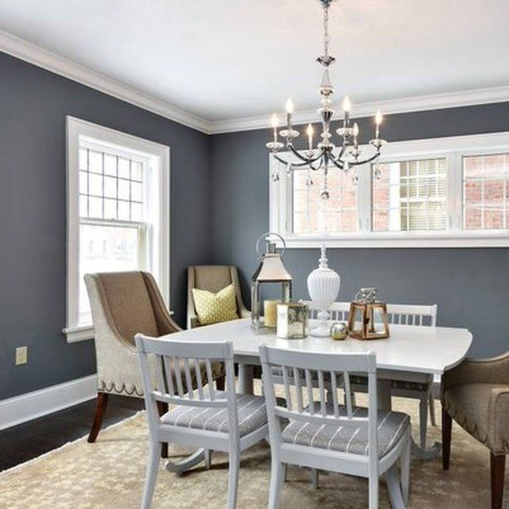
Sherwin Williams charcoal gray paints are my favorite options for adding depth and sophistication to any space. These shades of gray are versatile and can easily be adapted to different styles, from modern to traditional. Whether you want a bold statement or a subtle backdrop, charcoal gray offers the perfect solution.
One thing I love about these paints is the wide variety of shades. Each has unique undertones, from cooler blue tones to warmer brown hues. This lets you find the ideal match for your home’s lighting and decor.
I’ll discuss some of the best Sherwin Williams charcoal gray paints in this article. I’ll help you choose the perfect shade and share tips on using them effectively in your space.
Understanding Undertones in Charcoal Gray
Undertones are subtle hints of color that show through the primary color. These undertones can be blue, green, or brown in charcoal grey. They affect the color’s appearance in different lighting and how it pairs with other shades.
Undertones can change with different lighting. Natural light can bring out cooler tones like blue, while artificial light can highlight warmer tones like brown. Testing your chosen shade in your home’s light is essential before committing.
Consider your decor and lighting to choose the best charcoal gray for your space. If you have warm-toned furniture, a gray with brown undertones may look best. For more extraordinary spaces with lots of natural light, a gray with blue undertones can balance the space.
In conclusion, understanding undertones helps you select the right charcoal gray for your room. Pay attention to lighting and your home’s style to make the best choice.
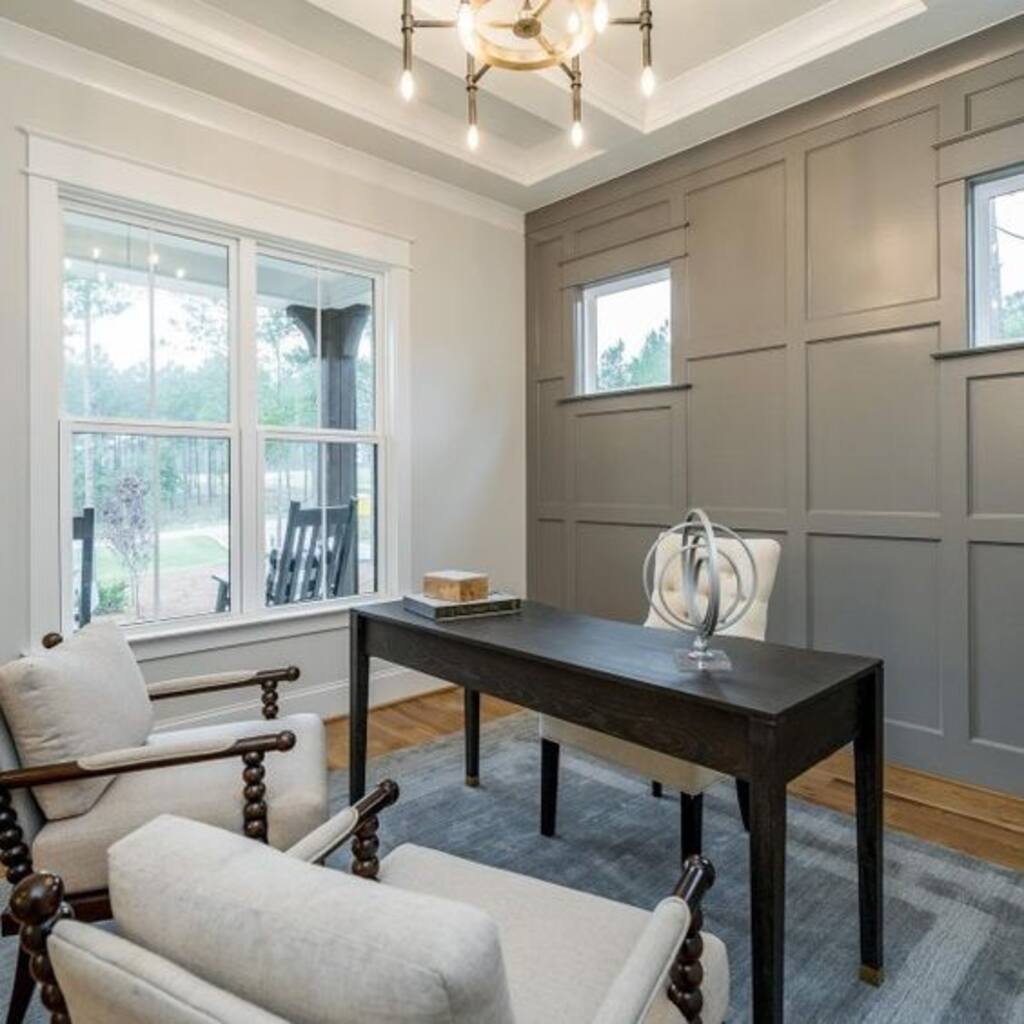
Mindful Gray Sherwin Williams 7016
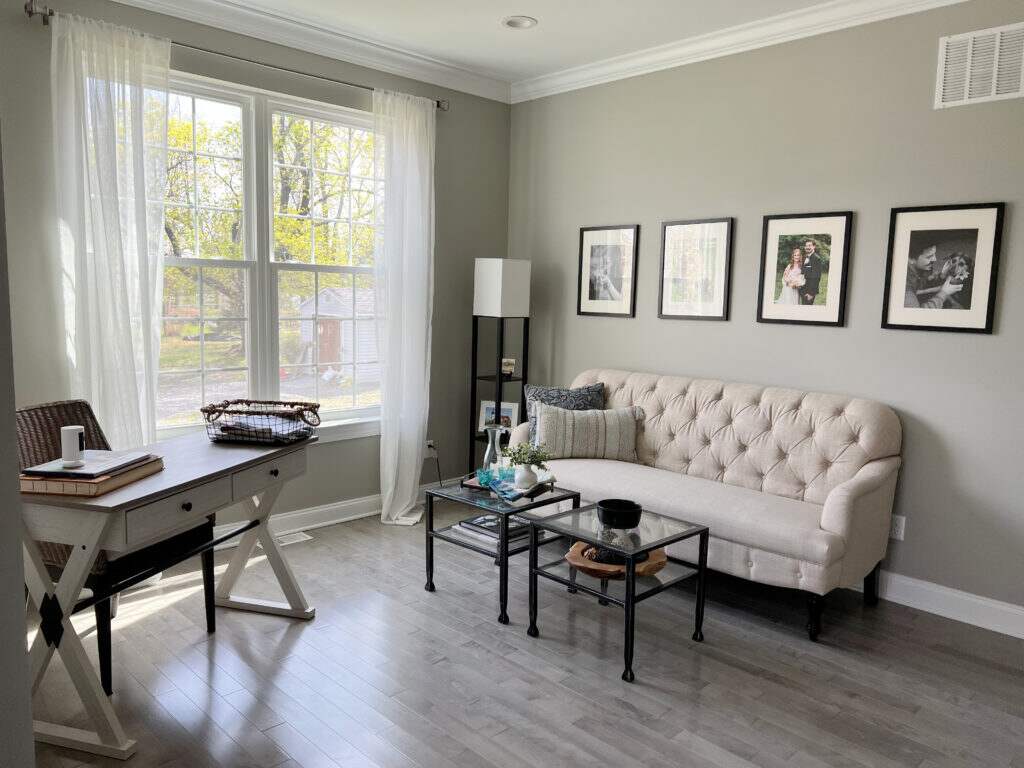
Mindful Gray is a top choice from the Sherwin-Williams collection. It has a Light Reflectance Value (LRV) of 48, reflecting some light but not a bright gray. Its medium tone makes this shade feel neither too light nor too dark. It works beautifully on walls, whether you’re painting an entire room or just an accent wall.
This gray has a subtle undertone. While it’s mostly neutral, you might notice tiny hints of green or blue, though they’re barely visible. Mindful Gray is warm but balanced. When placed next to a cooler gray, its warmth becomes more noticeable.
Lighting plays a significant role in how this color looks. Always test a small patch in your space to see how it reacts to natural and artificial light.
Its versatility makes Mindful Gray a fantastic choice for any room—living areas, kitchens, bedrooms, or even exteriors. It’s a timeless shade that adapts well to different styles and settings.
Sherwin Williams Peppercorn 7674
Peppercorn SW 7674 is a deep, rich gray that stands out in any room. Its subtle blue undertones give it a cool, modern feel. This color is perfect if you’re looking for something bold yet neutral.
With an LRV of 10, Peppercorn is quite dark. It’s not entirely black, but it has a depth that makes it feel dramatic. This makes it an excellent choice for accent walls or exteriors where you want to make a strong statement.
One of the best things about Peppercorn is its versatility. It pairs beautifully with both light and dark colors. Try it with white trims for a modern touch, or combine it with lighter shades to add contrast.
Peppercorn works well in spaces that need a bit of sophistication, such as living rooms, dining rooms, or even kitchens. However, because it’s a dark color, be mindful of lighting. In spaces with less light, it can make a room feel smaller.
Peppercorn is a versatile, stylish color that can transform any space with its bold, calm tone. It brings depth and elegance to your home, whether used inside or outside.
Dorian Gray SW 7017
If you love natural gray shades, Dorian Gray might be perfect. This Sherwin-Williams color has an LRV of 39, making it darker than Mindful Gray but not overly dark. It strikes an outstanding balance, offering just enough depth for your interiors. While warm-toned gray, it also has a subtle yellow hue. Don’t worry—it won’t look yellow on your walls!
This gray also has a slight purple undertone. However, purple only shows in certain types of lighting. It looks like a true neutral gray in bright daylight or good indoor lighting, so you won’t need to worry about the undertone becoming too obvious.
Before committing to this shade, test a small sample in your space. Lighting can dramatically change how paint colors look, so seeing Dorian Gray in your home’s unique lighting is essential.
This versatile shade works well in living rooms, bedrooms, or kitchens. Whether you want a cozy vibe or a modern touch, Dorian Gray delivers a timeless and natural look.
Sherwin Williams Iron Ore 7069
Iron Ore SW 7069 is a deep, dark gray with a hint of brown. Its strong, rich tone adds sophistication to any room. This color brings a modern, edgy look while feeling grounded and balanced.
With an LRV of 6, Iron Ore is a very dark color. It’s not black, but it’s close. This makes it perfect for accent walls or dramatic contrast in rooms. It works well with light and dark colors, offering plenty of flexibility.
Iron Ore is a versatile shade. It pairs beautifully with whites and lighter grays for a striking contrast. Mix it with bold colors like mustard yellow or teal to create a unique, modern vibe.
This color is ideal for living rooms, bedrooms, or even exteriors. However, because it’s dark, it can make spaces feel smaller. So, it’s best used in rooms with plenty of light to avoid overwhelming the space.
In conclusion, Iron Ore SW 7069 is a bold, elegant gray that brings depth and sophistication to any area. Whether indoors or outdoors, it makes a powerful, stylish statement.
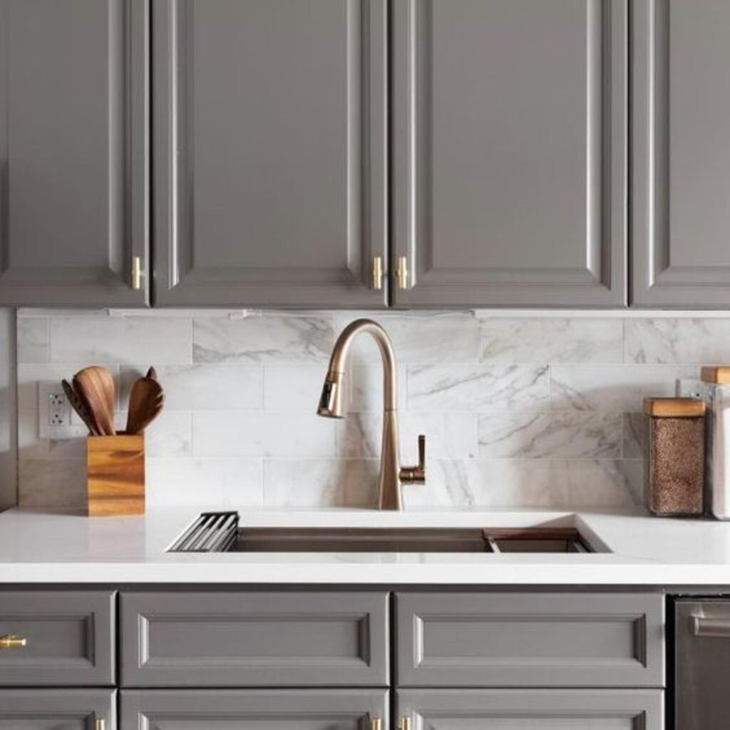
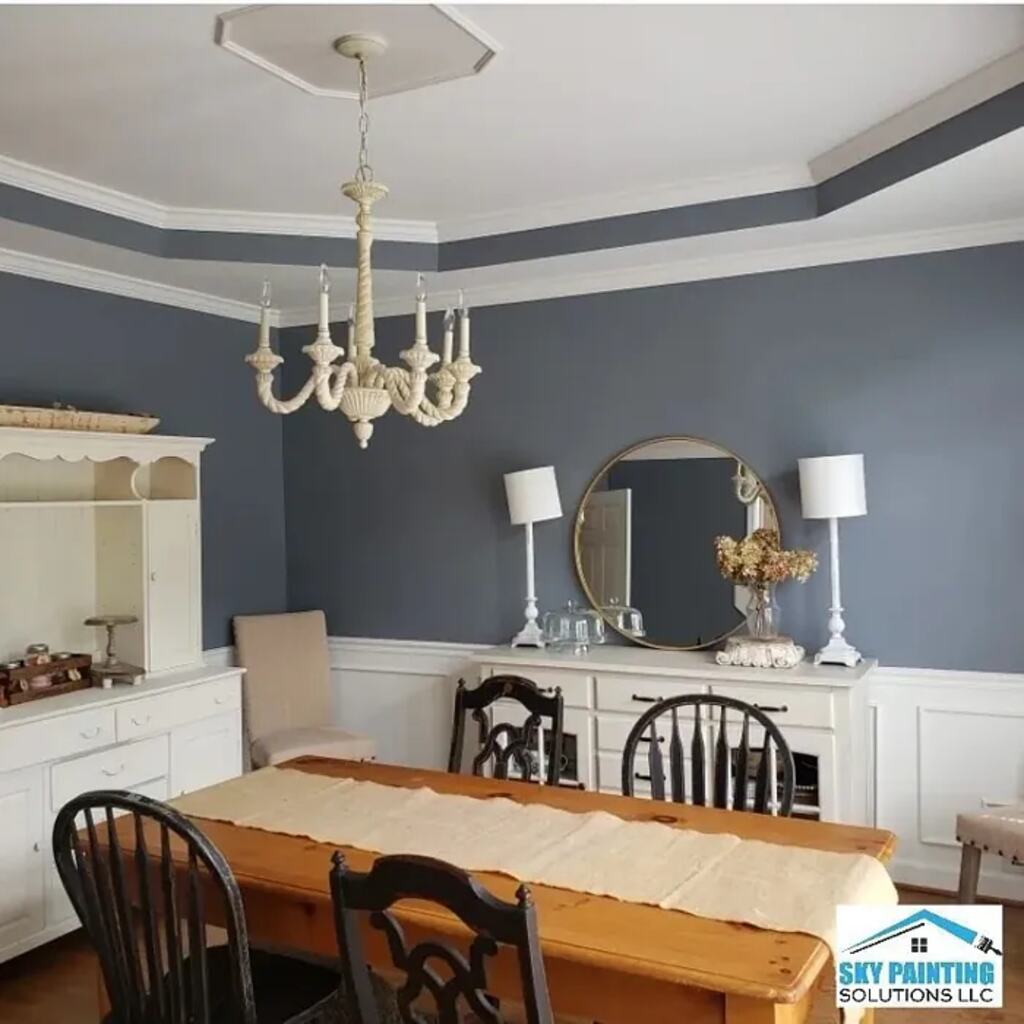
Sherwin Williams Dovetail 7018
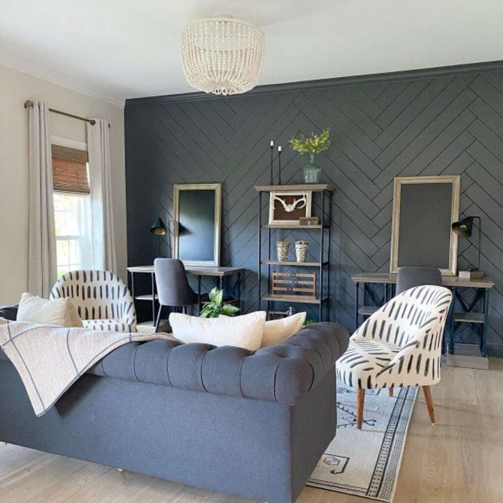
If you’re ready for a deeper, darker gray, Dovetail is an excellent choice. This Sherwin-Williams shade leans toward the darker end of the scale, with an LRV of 26. It reflects less light, giving it a rich and bold appearance. Dovetail belongs to the yellow hue family but has a slight blue undertone that adds depth and character.
This charcoal gray pairs beautifully with white trims, creating a strong and elegant contrast. Its gray undertone is dominant, but you might notice a hint of brown, making it warm. The combination of warmth and depth gives Dovetail a masculine edge, softened just enough for versatility.
Lighting can significantly affect how this color appears. It is always a good idea to test a small section in your space before committing to it. Whether you choose a glossy or flat finish, Dovetail will deliver a distinct look.
This shade adds drama to living rooms, bedrooms, or accent walls. It’s a timeless color that works beautifully in modern and classic interiors.
Urbane Bronze SW 7048
Urbane Bronze SW 7048 is a deep, warm brown-gray that creates a cozy, inviting atmosphere. Its slight metallic undertone gives it a sophisticated, modern feel. This color adds warmth without being overpowering.
With an LRV of 8, Urbane Bronze is dark but not too heavy. It’s perfect for accent walls, cabinets, or even exteriors. This shade stands out but still feels balanced and grounded.
Urbane Bronze’s versatility makes it easy to pair with many other colors. It looks stunning with whites, gold, and natural wood tones. Pair it with light grays or bold accent colors for a more dramatic look.
Urbane Bronze works well in spaces that need a touch of elegance. Use it in living rooms, dining rooms, or bedrooms for a stylish and warm ambiance. However, because it’s a darker color, be mindful of lighting. It’s best used in rooms with natural light to prevent the space from being too closed.
In conclusion, the Urbane Bronze SW 7048 is a rich, warm color that brings sophistication and comfort to any room. Whether indoors or out, it’s perfect for creating a welcoming, modern space.
Sherwin Williams Pavestone Gray 7642
Pave Stone is a lovely choice for living rooms or bedrooms. It’s a warm gray with an LRV of 32, placing it in the medium-depth range. While it’s not a bright color, it offers the perfect balance if you’re looking for a cozy and sophisticated gray.
This shade isn’t a true gray, though. It carries a soft warmth with a slight green undertone. You may notice the green more in specific lighting, so testing a sample in your space is essential.
Pave Stone pairs beautifully with crisp whites, such as Sherwin Williams Pure White or Benjamin Moore Oxford White. Together, they create a clean and timeless look.
Because this is a deeper gray, it shines best in rooms with plenty of natural light. It’s also a fantastic option for exteriors. Combine it with brick or stone accents for a polished, classic appearance. However, be mindful of the green undertone when using it outdoors.
Whether indoors or out, Pave Stone adds warmth and style, making it a versatile and dependable choice for your next project.
Cyberspace SW 7076
Cyberspace SW 7076 is a bold, dark gray with a cool undertone. Its sleek, modern look can instantly transform any space. This color is sophisticated and edgy, making it perfect for contemporary interiors.
With an LRV of 6, Cyberspace is quite dark. It’s not black, but it has a depth that gives it a strong presence. It works well as an accent wall or for smaller spaces like hallways.
This color pairs well with both light and dark shades. Combine it with whites, light grays, or soft pastels for a balanced look. Cyberspace works beautifully with metallics or bold colors like red or gold for a dramatic effect.
Cyberspace is ideal for living rooms, bedrooms, or even kitchens. It adds richness and style, but be cautious in rooms with little natural light. Dark colors can make spaces feel smaller, so use Cyberspace in areas with enough light to avoid a cramp feel.
Overall, Cyberspace SW 7076 is a versatile, assertive gray. It’s perfect for adding depth and a modern touch to any room.
Sherwin William Gauntlet gray 7019
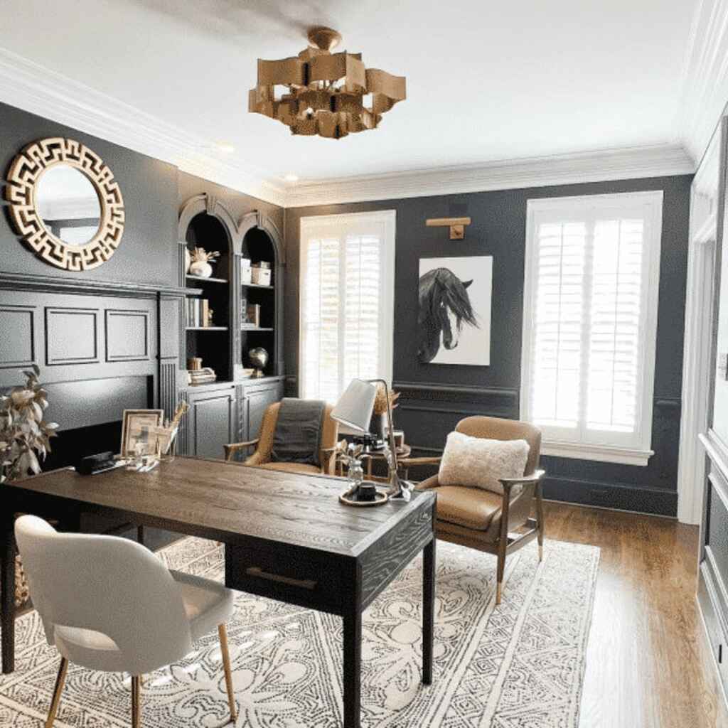
Gauntlet Gray is a perfect choice if you’re looking for a dark gray. It’s a deep shade with a strong, almost black appearance, though it has a brown taupe undertone. Despite its dark look, it doesn’t lean toward pure black.
With an LRV of 17, Gauntlet Gray falls in the medium-dark range. It’s a bold color, ideal for making a statement. This shade works beautifully for exteriors, kitchen cabinets, or even as an accent wall color.
Gauntlet Gray also has a muted violet undertone. While there’s a faint hint of green, it’s barely noticeable. Because of its depth, pairing it with a crisp white, like Sherwin Williams Pure White, creates a striking contrast.
Although Gauntlet Gray is stunning for exteriors, it can be tricky to match with other colors. Don’t worry, though. Please test a small sample to see how it fits with the lighting and different colors in your space. This will help you make sure it looks just right.
Gauntlet Gray is an intense, sophisticated color that can add drama and elegance to any space, inside or out.
Software SW 7074
Software SW 7074 is a soft, warm gray that adds a calm and inviting feel to any space. It’s a neutral shade, perfect for creating a cozy atmosphere without being too heavy.
With an LRV of 41, the Software falls into the medium-light range. It’s not too dark yet has enough depth to warm a room, making it an excellent choice for bedrooms, living rooms, or offices.
One of the best things about Software is how versatile it is. It pairs well with both light and dark colors. Combine it with whites, creams, or light blues for a soft, balanced look. You can also mix it with darker shades for more contrast and drama.
The software works in various lighting conditions. It will stay warm and inviting in natural or artificial light. However, be mindful of using it in spaces with poor lighting, as it may lose some warmth.
In conclusion, Software SW 7074 is a gentle and flexible gray. It’s perfect for creating a relaxing, stylish space that feels modern and comfortable.
Sherwin Williams Grizzle Gray 7068
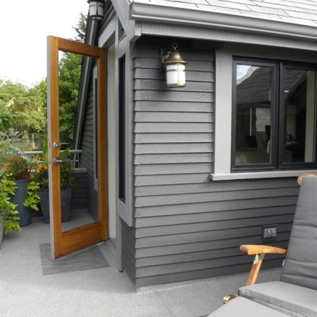
If you love dark, moody vibes, Grizzle Gray is the color for you. This charcoal gray works excellent for house exteriors or as an accent color.
With an LRV of 13, Grizzle Gray is a very dark color. You might think it will look black but don’t worry. Its cool green undertone keeps it from appearing completely black. Instead, you get a deep, bold gray.
Grizzle Gray pairs beautifully with lighter, neutral colors. These really stand out against the dark shade and add more depth to the space, making it a perfect backdrop for bright accents.
One great idea is to paint an accent wall in Grizzle Gray. You can then use that wall as a gallery to display your photos or artwork. The bold gray will make your collection pop.
Grizzle Gray offers a dramatic, stylish look, making it an excellent choice for those who want a unique, dark color in their home.
Night Owl SW 7061
Night Owl SW 7061 is a bold, dark gray with a cool undertone. Its depth and intensity stand out, making it perfect for creating a dramatic, modern look.
With an LRV of 6, Night Owl is a very dark color. While it’s not black, it has a deep, rich appearance that adds sophistication to any room. It is ideal for accent walls or feature areas like kitchens and home offices.
One of Night Owl’s strengths is its versatility. It pairs well with both light and dark colors. Combine it with whites or light grays to balance its depth for a clean, striking contrast. It also works well with metallics or bold colors to create a stylish statement.
Night Owl is perfect for spaces that need a touch of elegance and drama. It works well in living rooms, dining rooms, or bedrooms. However, because it’s dark, ensure the room has enough light. In dim spaces, it can make the area feel smaller.
In conclusion, Night Owl SW 7061 is a deep, sophisticated color. It adds depth and style to any room, making it an excellent choice for those seeking a bold yet versatile shade.
Serious Gray SW 6256
Serious Gray SW 6256 is a deep, rich gray with a subtle hint of warmth. It offers a balanced tone that’s both strong and inviting, bringing depth and sophistication to any room.
With an LRV of 13, Serious Gray is a darker shade. It’s not as dark as black but creates a bold look. It’s perfect for accent walls, living rooms, or even exteriors.
One of Serious Gray’s best features is its versatility. It pairs well with warm and cool colors. For a calming effect, combine it with whites or soft neutrals. If you prefer more contrast, pair it with vibrant colors like mustard or teal.
This color works well in spaces where you want to make a statement. It’s ideal for areas like the living room, dining room, or study. However, since it’s a darker shade, be mindful of lighting. In rooms with limited light, it might make the space feel smaller.
In conclusion, Serious Gray SW 6256 is a versatile, bold color. It’s perfect for creating a stylish, sophisticated atmosphere while adding depth and warmth to your space.
Sherwin Williams Web Gray 7075
Web Gray is an excellent choice if you need a versatile dark gray. It works well on cabinets, exteriors, and even as an accent wall color.
Web Gray is a deep shade with impressive depth. It’s a cool color with a bold blue undertone. While there’s a hint of green, it’s not very noticeable.
As we mentioned before, lighting can change how colors appear. However, Web Gray will always look cool-toned, no matter the light. With an LRV of 13, it’s a dark color.
Because it’s so dark, we suggest avoiding Web Gray in rooms with little light. This color may feel too dark and small in poorly lit spaces.
Web Gray is perfect for creating a sleek, modern look. Test it in your space to see how it reacts to the lighting. It’s a bold choice, but it can really stand out when used correctly.
Black Fox SW 7020
Black Fox SW 7020 is a rich, dark brown-gray that brings sophistication to any room. Its warm undertone makes it feel cozy and inviting. This color adds depth and character without being too bold.
With an LRV of 8, Black Fox is a dark shade. It’s not entirely black but deep enough to create a strong statement, making it perfect for accent walls, cabinets, or even exteriors.
Black Fox pairs well with both light and dark colors. Try pairing it with light whites or soft neutrals for a balanced look. You can combine it with bold accents like gold, red, or mustard to create a stylish contrast.
This color works best in spaces that need a touch of elegance. It’s perfect for living rooms, bedrooms, or offices. However, it must be used in well-lit rooms since it’s a dark shade. In dim spaces, Black Fox might make the room feel smaller.
Overall, Black Fox SW 7020 is a deep, sophisticated color. It’s perfect for those looking to add warmth and elegance to their space while keeping the look modern and stylish.
Sherwin William Keystone Gray 7504
Some people debate whether Keystone Gray is more of a greige or gray. To clear things up, it’s a gray color. It’s a perfect neutral with a good balance of warm undertones.
Keystone Gray is warm, making the space feel soft and welcoming. Unlike cooler, blue-toned grays, it brings warmth and comfort to any room. Plus, it’s versatile, working well in many spaces and colors.
With an LRV of 29, it falls in the middle of the medium range. This makes it an excellent choice for rooms like bathrooms, where a calm, neutral vibe is needed.
This color has subtle undertones of violet and green, but they’re barely noticeable, so you don’t need to worry about them showing up too much.
Keystone Gray works well for interiors and exteriors. However, because of its warm undertones, it might feel too warm in bright lighting. It’s best to use this color indoors if you prefer a cooler look. Keystone Gray is a versatile, inviting color that can bring balance and warmth to your space.
Things to Keep in Mind Before Choosing a Dark Gray Color
- Dark gray is not ideal for smaller rooms. It can make the space feel even smaller and darker.
- However, dark gray can be a great way to fill large rooms and create a cozy atmosphere.
- Warm-toned dark grays make a room appear smaller, while cool-toned dark grays keep the space open.
- Dark gray is not suitable for poorly lit rooms. It can make a dark room look even darker.
- Good lighting is crucial when using dark gray. It affects how the color looks and which undertones are visible.
- Always test a sample of the color in your space to see how it appears before fully committing.
- Make sure dark gray fits your home’s overall theme. It’s versatile but can clash with specific colors if not carefully paired.
- Dark gray has undertones that can become more noticeable next to specific colors, so it’s essential to consider this when choosing your shade.
- Test how the color looks in your home’s lighting before buying it.
- Dark grays are perfect for exteriors, accent walls, or studies but can make spaces feel gloomy. Pair with lighter colors to balance it out.
If you paint all the walls dark gray, use contrasting trims to add structure and prevent the space from feeling too heavy.
Practical Tips for Using Charcoal Gray Paint
Preparing the space properly before painting with dark colors like charcoal gray is essential. Start by cleaning the walls and filling in any cracks or holes. This helps the paint go on smoothly and ensures an even finish.
Next, choose the right tools. Use high-quality brushes and rollers for a clean, smooth application. A roller works best for large areas, while a brush is perfect for edges and corners. Always apply paint in thin, even coats to avoid streaks.
Common mistakes to avoid include skipping primer or overloading your brush or roller. Primer helps the dark gray paint cover better, preventing the old color from showing through. Also, avoid applying too much paint at once, as this can lead to uneven drying and streaks.
If you’re unsure about applying dark paint or your space has tricky areas, it might be time to hire a professional. They have the expertise to handle large projects and tricky spots, ensuring a flawless finish.
In conclusion, with proper preparation, the right tools, and careful techniques, you can achieve a beautiful charcoal gray look for your space.
Conclusion
In conclusion, Sherwin Williams’s charcoal gray paints offer a variety of shades that can suit any style or space. These colors can transform a room, whether you’re going for a bold accent wall or a more subtle background. Remember, choosing the right tone based on your lighting and decor is key.
This guide helps you find the perfect charcoal gray for your home. If you have any experiences or tips, please share your thoughts in the comments below. I’d love to hear how you’ve used these colors in your space!