

In this blog, I’m diving into Crisp Linen (SW 6378) by Sherwin-Williams-a soft, sophisticated off-white that strikes the perfect balance between warmth and freshness.
If you’ve ever struggled to find a neutral that isn’t too yellow or too stark, you’re not alone. Choosing the right off-white can be tricky, and that’s where Crisp Linen comes in. Is it the perfect warm neutral for your space? How does it look in different lighting? And what colors pair best with it?
I’ll answer all these questions and more, so by the end of this blog, you’ll know exactly whether Crisp Linen is the right pick for your home.
What Kind of Color is Sherwin Williams Crisp Linen?
Crisp Linen sits within the beige family but leans toward a soft, warm off-white rather than a deep beige.
It has just enough color to keep it from looking stark, yet it remains light enough to brighten up a room.
The name itself-Crisp Linen-perfectly captures its essence. Imagine fresh, sun-dried linen billowing in a warm breeze; that’s the kind of feeling this paint color brings to a space.
This shade is part of Sherwin Williams’ Living Well and Senior Living Warm Foundations collections, which means it was carefully selected for its ability to create a welcoming and comfortable environment.
It’s designed to promote a sense of calm while maintaining a classic and timeless appeal.
Is Crisp Linen a Warm or Cool Color?
Crisp Linen is a warm color. Its subtle beige undertone carries a gentle warmth that makes it feel cozy and inviting.
If you’ve ever walked into a room and immediately felt at home, there’s a good chance it had a warm neutral like Crisp Linen on the walls.
Because of its warm nature, this color works exceptionally well in spaces where you want to create a sense of comfort-like bedrooms, living rooms, and dining areas.
It pairs beautifully with earthy tones, wood finishes, and soft textiles, making it a great choice for homes with a natural or rustic aesthetic.
Understanding the Undertones of Crisp Linen
When choosing a neutral paint color, undertones play a significant role in how the color will look once it’s on your walls.
Crisp Linen has subtle red and peach undertones, giving it a warmth that prevents it from looking too yellow or too cool.
The undertones are soft and muted, so while they add warmth, they don’t make the color look overly pink or peachy.
This is one reason why Crisp Linen is such a versatile neutral-it maintains its warmth without feeling too intense.
However, the way these undertones appear in your home will depend on lighting and surrounding colors.
How Does Lighting Affect Crisp Linen?
Lighting is a crucial factor in how any paint color looks throughout the day. With Crisp Linen, you’ll notice subtle shifts in its warmth depending on the amount and type of light in the room.
- North-facing rooms: These spaces tend to get cooler, bluish light, which can slightly neutralize Crisp Linen’s warmth.
It will still appear soft and creamy, but it might look a touch more subdued compared to a warmer space.
- South-facing rooms: Since these rooms get consistent warm sunlight, Crisp Linen will appear at its coziest here.
The warmth in the light will enhance its beige and peachy undertones, making it feel extra inviting.
- East-facing rooms: The morning light in these rooms is warm and soft, which will enhance Crisp Linen’s natural warmth early in the day.
As the sun moves, the color may appear more neutral.
- West-facing rooms: In the late afternoon, west-facing rooms get a golden glow, which will emphasize the warmth of Crisp Linen even more, making it feel richer and more golden in tone.
Artificial lighting also plays a role. Soft white or warm LED bulbs will complement Crisp Linen beautifully, enhancing its coziness.
However, cooler-toned lights (such as daylight LED bulbs) may make the color appear slightly more neutral.
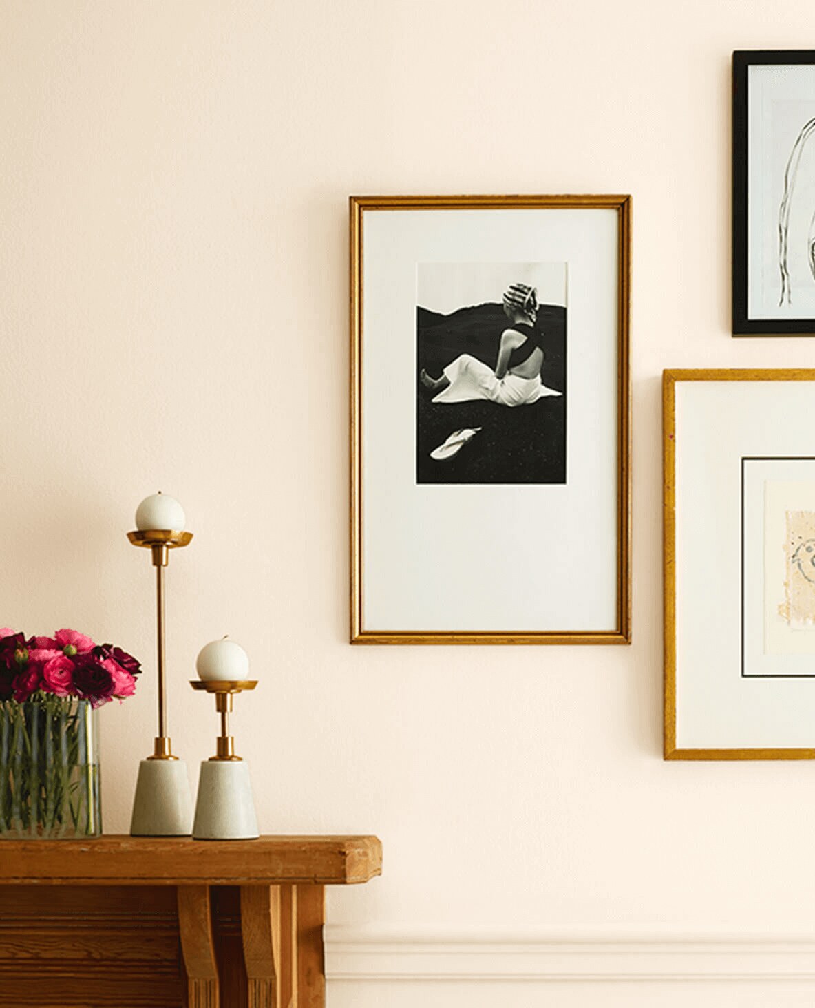
Where to Use Sherwin Williams Crisp Linen in Your Home
One of the best things about Crisp Linen is that it works in a variety of spaces. It’s neutral enough to act as a backdrop but warm enough to add character.
If you’re wondering where this shade would work best, here are some ideas:
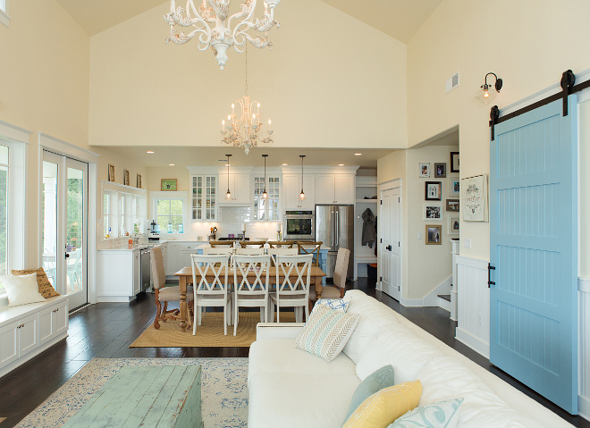
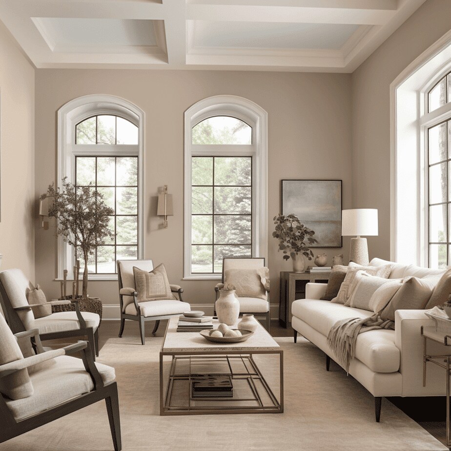
Living Rooms
Crisp Linen is a fantastic choice for living rooms, especially if you want a color that feels welcoming and timeless.
It pairs well with wood furniture, cozy textiles, and warm accent colors like terracotta, soft greens, and deep browns.
Whether your style is modern farmhouse, traditional, or even minimalist, Crisp Linen creates a versatile backdrop that can adapt to your decor.
Bedrooms
If you want your bedroom to feel calm and serene, Crisp Linen is an excellent option.
The warmth in this color makes the room feel cozy and inviting, especially when paired with soft linens, plush bedding, and warm-toned wood furniture.
It’s a great alternative to stark white walls, giving the room a bit more depth while still maintaining a light and airy feel.
Kitchens and Cabinets
Crisp Linen isn’t just for walls-it also looks beautiful on kitchen cabinets.
If you love the idea of a neutral, warm-toned kitchen but don’t want something too beige, Crisp Linen strikes the perfect balance.
Pair it with brass hardware, butcher block countertops, and creamy white tile for a warm and sophisticated kitchen aesthetic.
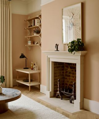
Bathrooms
For bathrooms, Crisp Linen can create a spa-like atmosphere.
Since bathrooms often have a lot of cool elements like tile and mirrors, the warmth of Crisp Linen helps to balance things out.
It pairs well with soft white trim, warm wood vanities, and natural stone accents.
Hallways and Entryways
Because Crisp Linen is such a welcoming color, it’s an ideal choice for hallways and entryways.
These spaces often don’t get a lot of natural light, but Crisp Linen’s warm, light-reflecting quality can help them feel brighter and more open.
Coordinating Colors for Crisp Linen
Crisp Linen is incredibly versatile when it comes to color pairings. Whether you want to keep things neutral or add some contrast, there are plenty of beautiful options to consider.
Soft and Subtle Pairings
If you want a monochromatic look, you can pair Crisp Linen with other warm, off-white shades like:
- Sherwin Williams Medici Ivory (SW 7558)-A soft, warm ivory that enhances Crisp Linen’s natural coziness.
- Sherwin Williams Eggwhite (SW 6364)-A slightly deeper beige that blends beautifully for a layered, tonal look.
Adding Contrast
For a bit more depth and contrast, you can pair Crisp Linen with richer shades like:
- Sherwin Williams Dockside Blue (SW 7601)-A dusty blue that complements Crisp Linen’s warmth without overwhelming it.
- Sherwin Williams Warm Beige (SW 0035)-A deeper beige that enhances the coziness of Crisp Linen.
Accents and Decor
To make Crisp Linen stand out, use natural textures like woven rugs, wooden furniture, and linen curtains.
Warm metallic accents like gold, brass, or bronze will also bring out the richness of the color.
Conclusion
Sherwin Williams Crisp Linen (SW 6378) is a warm, inviting neutral that works beautifully in a variety of spaces. Its versatility, timeless appeal, and ability to pair well with both soft neutrals and deeper tones make it a fantastic choice for anyone who wants a home that feels both elegant and comfortable. If you’re considering Crisp Linen for your next painting project, give it a try-you might just find that it’s the perfect color for your space!
FAQs
Is Sherwin Williams Crisp Linen a true white or a beige?
Crisp Linen is more of a soft, warm off-white with subtle beige undertones. It’s not a stark white, but it’s also not a deep beige-it sits right in between, offering warmth and versatility without feeling too yellow.
Does Crisp Linen look yellow on the walls?
Not necessarily! While it has warm undertones, it doesn’t mean overly yellow. However, in rooms with a lot of warm lighting (like west-facing spaces or those with warm LED bulbs), it may appear slightly creamier.
What colors pair well with Crisp Linen?
Crisp Linen looks great with soft blues, warm grays, and earthy greens for a balanced palette. For trim, warm whites like Sherwin Williams Alabaster work beautifully, while deeper beiges or browns can add depth.
Is Crisp Linen a good choice for kitchen cabinets?
Absolutely! Its soft warmth makes it a great alternative to bright white cabinets, adding coziness without looking too dark. It pairs especially well with brass hardware and natural wood tones.
Will Crisp Linen work in a north-facing room?
Yes, but expect it to look a bit cooler and more neutral due to the cooler, blue-tinted light. If you want to maintain its warmth, pair it with warm-toned decor, lighting, or wood accents.