

Have you ever gazed into the night sky and wondered why some patches appear darker than others? You’re not alone. What we casually call “black” encompasses a fascinating spectrum of darkness, each shade telling its unique story.
From the velvety depth of charcoal to the mysterious allure of obsidian, these variations go far beyond the simple absence of light.
Join me as I venture into this overlooked dimension of color where artists find inspiration, scientists make discoveries, and designers create magic with what many dismiss as merely “dark.”
Understanding the Spectrum of Black
Think you know black? Look closer. The color you believe is just “black” actually exists in countless variations. Your eyes might not immediately detect the differences, but they’re there.
What makes each black unique comes down to subtle undertones and technical specifications. Ever noticed how some blacks look bluish under certain lights? This happens because black isn’t truly the absence of all color.
Most blacks contain traces of blue, red, or green undertones. In digital design, a pure black might be RGB(0,0,0), while a rich black could be RGB(10,10,10) with subtle blue hints. Your screen and printer interpret these codes differently, creating various depths and dimensions of darkness.
Popular Classifications of Black Shades
Classic and Pure Blacks
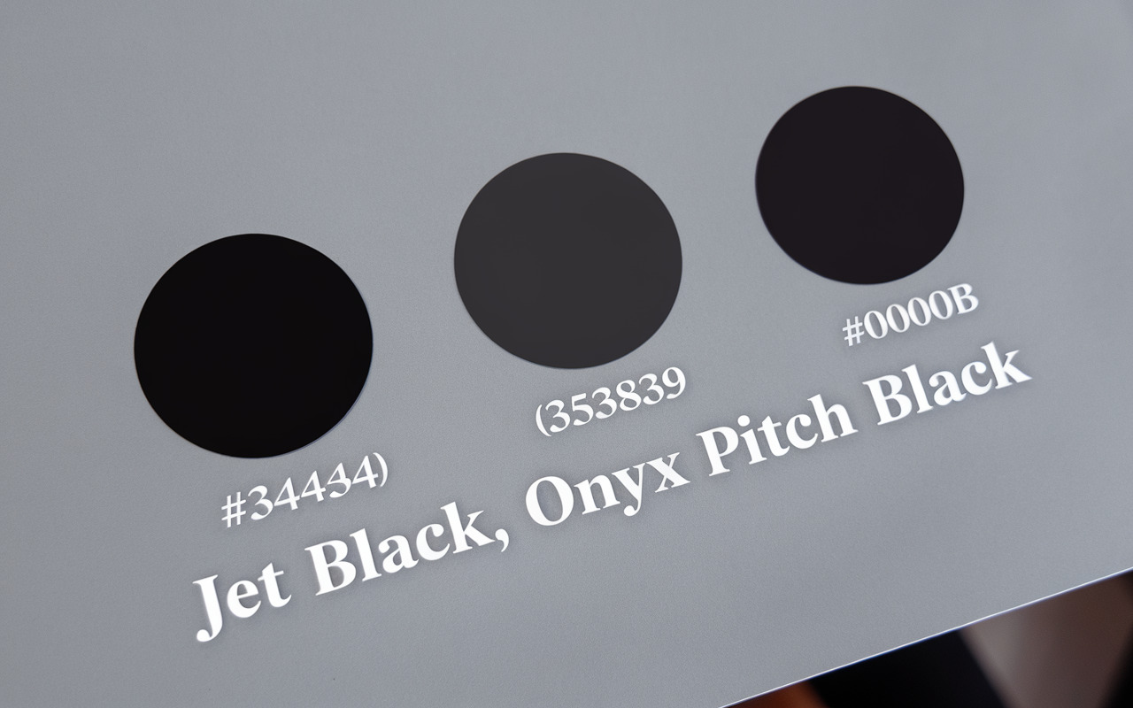
You’ve seen pure blacks countless times in formal attire and sleek electronics. Jet Black (#343434) stands as the standard-bearer, bold, dramatic, and instantly recognizable. Try pairing it with bright white for maximum contrast or with metallic accents for a luxurious feel.
Onyx (#353839) offers a softer approach with its subtle gray undertones. This versatile shade works beautifully in modern interiors where a pure black might feel too harsh. Does your space need sophistication without intensity? Onyx delivers this balance perfectly.
Pitch Black (#0B0B0B) and Vantablack represent the extremes of darkness. Pitch Black creates dramatic shadows in photography and design. Vantablack, absorbing 99.965% of visible light, tricks your eyes into seeing nothing but a void. These blacks pair best with vibrant colors that pop against their depth.
Blacks with Cool Undertones
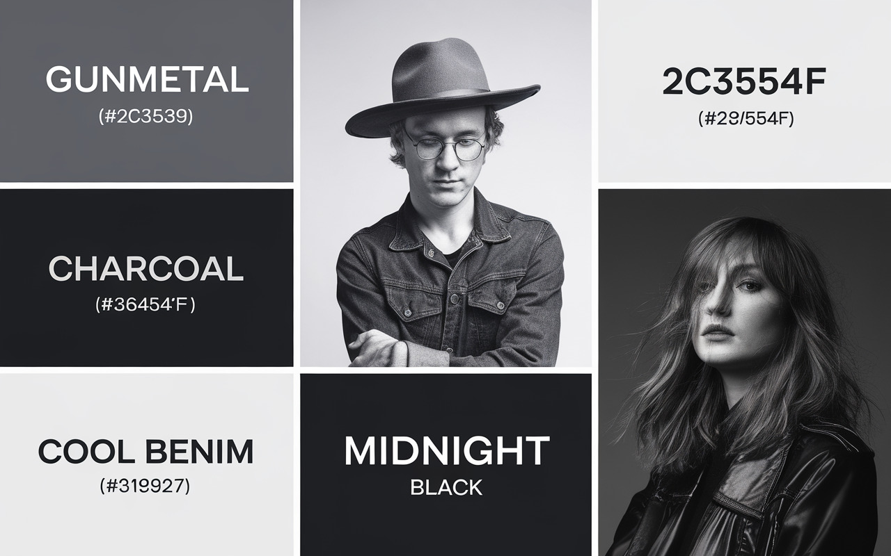
Cool-toned blacks bring calm and depth to your palette. Midnight Black (#2C3539) carries subtle blue undertones that evoke night skies. This versatile shade pairs beautifully with silver, light blues, or purples for an ethereal effect.
Looking for modern elegance? Cool Black (#151922) and Black Denim (#191C27) deliver sophisticated blue hints reminiscent of evening wear and quality jeans. These shades work wonderfully with pastels or other cool tones for contemporary designs.
Charcoal (#36454F) and Gunmetal (#2C3539) occupy the space between black and gray. Their blue-gray undertones create dimension in furniture, fashion, and digital interfaces. Pair these with bright yellows or corals for unexpected visual interest, or with whites and light grays for professional polish.
Blacks with Warm Undertones
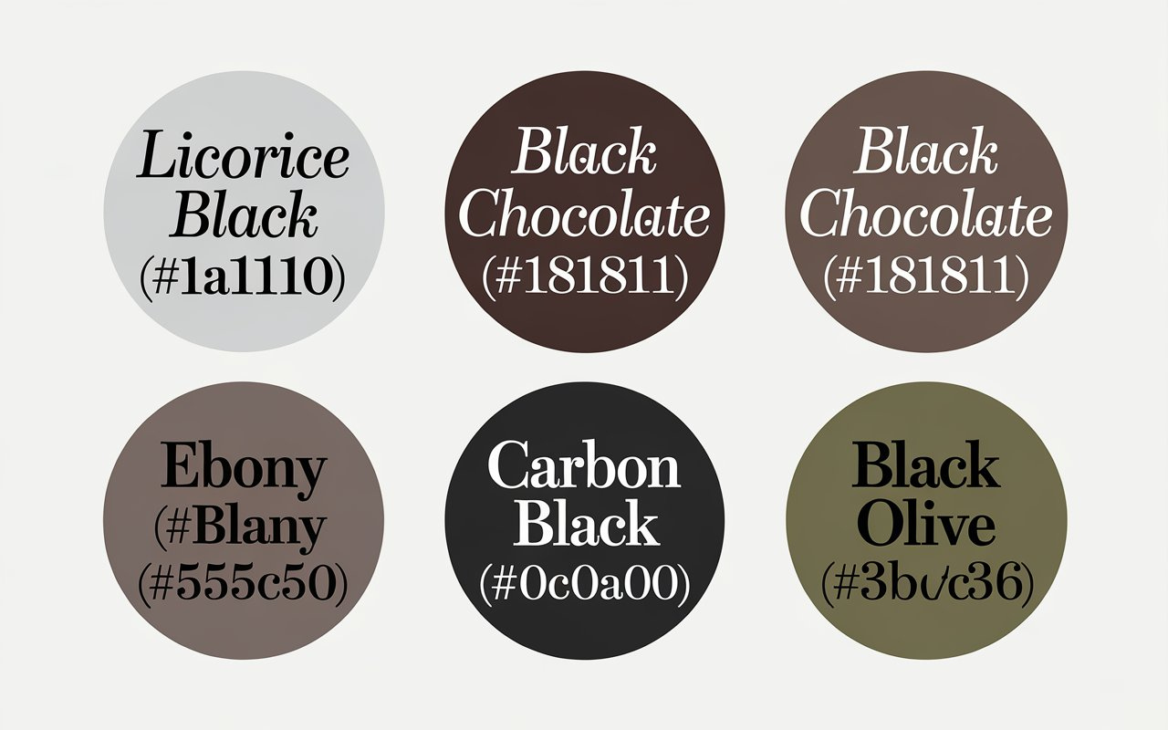
Warm blacks add richness and comfort to any application. Licorice Black (#1A1110) carries reddish undertones that feel inviting rather than stark. This shade pairs perfectly with cream, terracotta, or brass for a welcoming aesthetic.
Black Chocolate (#1B1811) and Ebony (#555D50) bring brown dimensions to darkness. These earthy tones remind you of cacao, rich wood, and fertile soil. Try combining them with sage green, burnt orange, or natural materials for organic harmony.
Carbon Black (#0C0A00) and Black Olive (#3B3C36) introduce subtle yellow and green hints, respectively. These unique blacks feel grounded and natural. Pair them with muted primary colors or neutrals for sophisticated designs that feel both timeless and fresh.
Black in Interior and Space Design
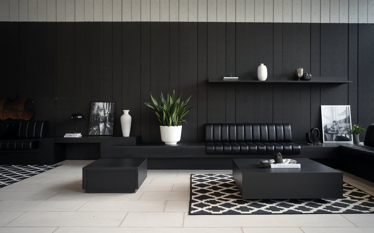
Walls need a strategy when going dark. Try Charcoal for the entire room. Use Jet Black only for accent walls. Furniture looks best in Onyx or Black Olive. Small accessories in Pitch Black create perfect focal points.
Depth comes from smart layering. Put dark items against light backdrops. Use multiple black tones, not just one. Paint your ceiling black with light walls. Watch how it stretches your space upward.
Materials change everything. Matte black absorbs light. It feels soft and refined. Glossy black reflects and intensifies. Mix these finishes. Place a matte table beside glossy vases. Notice the subtle drama it creates.
Black in Graphic and Digital Design
Screens and paper handle black differently. Avoid harsh RGB black (0,0,0) on screens. Choose Rich Black (10,10,10) instead. For print, use CMYK rich blacks (60C/40M/40Y/100K). Plain black ink falls flat.
Text needs the right black weight. Use lighter blacks for paragraphs. Save dark blacks for headlines. Match black intensity to font size. Small text needs gentler blacks. Large type can handle deeper tones.
Guide eyes with strategic black variations. Use darkest blacks for key elements only. Cool blacks feel technical and modern. Warm blacks create organic, traditional moods. Your black choices shape the user experience.

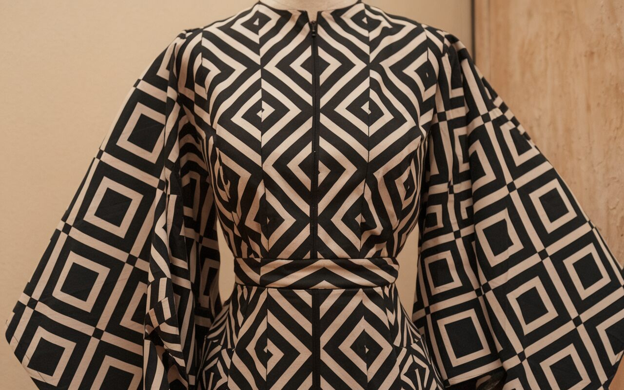
Black in Fashion and Product Design
Fabric transforms black completely. Denim blacks lean blue. Leather blacks run warm. Don’t try to match blacks perfectly. Cotton absorbs light. Silk reflects it. Your black outfit changes with the material.
Tech uses black finishes strategically. Matte black phones hide fingerprints. Glossy TVs boost contrast. Car designers avoid pure black. They prefer charcoals with subtle undertones. These show curves better.
Seasons shift black trends constantly. Summer likes lighter blacks. Winter embraces deeper tones. Material changes how black appears. Plastic looks different from metal. Textured surfaces scatter light. Smooth surfaces create sharp reflections. Your black items never truly look identical.
Mood and Intention Considerations For Using Black Effectively
Each black triggers distinct emotions. Warm blacks like Licorice create comfort and intimacy in bedrooms. Cool blacks like Midnight convey professionalism in offices. Your luxury brand needs rich, deep blacks. Tech startups often use softer charcoals.
Ask yourself: what feeling do you want your space to evoke? Match your black to this intention. I once painted my studio in Black Olive and noticed immediate focus improvement during creative sessions.
Light transforms black dramatically. Your matte black wall appears different at noon versus evening. North-facing rooms make blacks look cooler. South-facing rooms warm them up. Test your chosen black under various light conditions before committing.
Consider contrast needs for readability. Black text needs sufficient contrast against backgrounds. Your design fails if information gets lost in the darkness. Remember elderly view, ers need 70% contrast minimum. Balance mood intentions with practical visibility needs.
Technical Implementation Guide For Using Black Effectively
Here’s your black toolbox: Jet Black (HEX #343434, RGB 52/52/52, CMYK 0/0/0/80), Midnight (HEX #2C3539, RGB 44/53/57, CMYK 70/35/35/80), and Licorice (HEX #1A1110, RGB 26/17/16, CMYK 30/50/50/95). Each black needs specific contrasts. Pair cool blacks with silvers and teals. Match warm blacks with creams and golds.
When I redesigned my portfolio using Gunmetal black with orange accents, client inquiries increased noticeably. You’ll see similar results with thoughtful pairing.
Take your phone camera to capture blacks in different lighting. Your eyes will deceive you, but photos don’t lie. Always view your blacks on multiple screens before deciding.
Avoid these common mistakes that I’ve learned the hard way:
- Using pure digital black (RGB 0/0/0) for large areas.
- Relying on a single screen when selecting blacks.
- Skipping print tests before production.
- Mixing conflicting undertones (blue-blacks with brown-blacks).
- Ignoring how blacks behave on different materials.
- Failing to check blacks under various lighting conditions.
- Overlooking printing limitations on budget papers.
- Using the same black for both digital and print projects.
- Not considering contrast needs for accessibility.
- Treating all blacks as interchangeable.
FAQs
What distinguishes different shades of black?
Black variations are created by subtle undertones (blue, red, green) and differences in light absorption properties. Compare two black items side by side under good lighting to notice these distinctions.
How do I select appropriate blacks for different media?
Digital designs benefit from rich blacks (RGB 10,10,10) rather than pure black (RGB 0,0,0) to maintain detail. For print, use composite blacks (such as 60C/40M/40Y/100K) instead of single-channel black to achieve depth.
Can I create custom black shades?
Yes. Create signature blacks by adding small percentages (1-3%) of another color to your base black. Blue adds sophistication, red creates warmth, and green introduces earthiness.
How should I account for environmental factors when using black?
Room orientation affects how blacks appear. North-facing spaces make blacks cooler, while south-facing rooms warm them. Test your chosen black under various lighting conditions and times of day before finalizing decisions.
Which black shades are best suited for specific industries?
Tech and digital companies often use cool blacks (Midnight, Gunmetal) for their innovative feel. Fashion and luxury brands prefer rich, deep blacks (Onyx, Jet). Hospitality and residential design benefit from warmer blacks (Licorice, Black Chocolate) that create comfort.
How can I incorporate black effectively without overwhelming a space?
Use black strategically on feature elements rather than entire spaces. Balance with lighter elements, incorporate reflective surfaces, and increase lighting by 25-30%. Consider using softer blacks like Charcoal or Black Olive rather than intense options.
What color combinations work effectively with different black shades?
Cool blacks (blue undertones) pair well with silver, teal, and cool pastels. Warm blacks (red/brown undertones) complement gold, terra cotta, and cream. Unexpected combinations like Midnight black with peach or Ebony with sage green can create distinctive design signatures.
Conclusion
Black isn’t just the absence of color, it’s a powerful design force. Your intentional black selections speak volumes about your creative vision. I’ve transformed ordinary spaces into extraordinary ones by simply switching from basic black to nuanced shades with personality. Start observing blacks around you.
Notice how your phone’s black differs from your car’s. Try sampling five different blacks for your next project instead of defaulting to the first option. The difference will amaze you. Your designs deserve this attention to detail. Begin your black exploration today with small experiments. Which undertone resonates with your current project’s goals?