

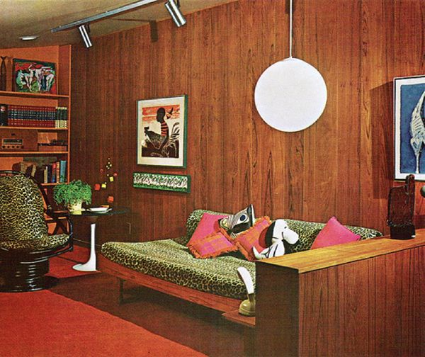
In this blog, I’m diving into the vibrant world of the 70s color palette—a bold mix of earthy tones and striking hues that define an era.
You might be wondering, “How can I bring these nostalgic shades into my modern home without it feeling too retro?” Whether you’re curious about reviving these colors or simply want to experiment with a fun design trend, I’ve got the tips and tricks to make it work seamlessly in today’s spaces.
Get ready to explore how to incorporate 70s colors freshly and stylishly that’s far from outdated.
Why the 70s Color Palette Still Rules?
The 70s color palette is having a major comeback—and for good reason.
With its earthy tones and bold hues, it brings a sense of warmth and nostalgia that instantly transforms any space. Think deep oranges, rich browns, mustard yellows, and avocado greens.
These colors are no longer just relics of the past decade; they’re the new statement makers in modern interiors.
What makes the 70s palette so timeless is its versatility. These colors can create everything from cozy, inviting rooms to bold, stylish statements. The mix of warm, natural shades brings both comfort and energy to any room, making it a perfect fit for today’s trend-driven yet nostalgic design world.
It’s not just about embracing retro vibes—it’s about adding character and personality to your space. Whether it’s a pop of burnt orange in your living room or a soft mustard tone for your kitchen cabinets, the 70s color palette proves that vibrant hues never go out of style.
So, if you’re ready to make your home feel both timeless and trendy, this palette is your go-to for an unforgettable makeover.
10 Best And Trendy 70s Color Palette
1. Sunset Serenade
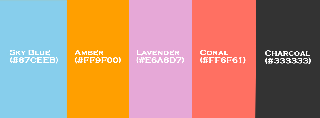
The Sunset Serenade palette is perfect for those who love the warmth of summer evenings. This combination of vibrant yet calming hues invites comfort and beauty into any room.
This palette is versatile enough for a living room, bedroom, or even a cozy reading nook. It can work for both modern and retro-inspired interiors, combining warmth with calming tones.
Coral (#FF6F61):
Bring this lively color into your living room or entryway as an accent wall or use it for throw pillows, a rug, or even artwork.
It’s cheerful and invigorating, making it great for areas where you want to greet your guests with energy and warmth.
Amber (#FF9F00):
Amber is perfect for creating a cozy, welcoming atmosphere.
You can use it for lighting fixtures, such as pendant lights over a kitchen island, or even as an accent on cabinetry for a touch of luxury.
Sky Blue (#87CEEB):
The cool and calming effect of Sky Blue makes it an ideal choice for bedrooms or bathrooms.
It pairs beautifully with Coral for an easy-going, relaxed vibe. Try it on walls, bed linens, or shower curtains.
Lavender (#E6A8D7):
Lavender has a soothing effect, perfect for adding tranquility. Use it in a master bedroom or office as wall color or bedding.
It adds just the right touch of softness without feeling too overbearing.
Charcoal (#333333):
Charcoal creates a sense of sophistication and depth. It works beautifully as an accent color, framing or grounding lighter colors.
You can consider using it for furniture, framed artwork, or small decor items.
2. Tropical Oasis
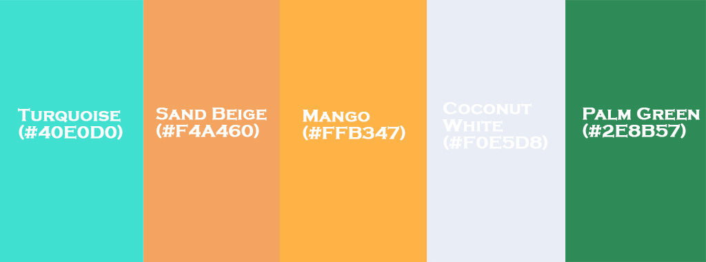
Transform your home into a tropical retreat with the vibrant and lush colors of Tropical Oasis. Whether you want to transport your space to an exotic getaway or just add some fun and freshness, this palette is perfect for you.
Turquoise (#40E0D0):
Think ocean waters and clear skies—Turquoise makes a perfect statement in bathrooms or living rooms.
You can use it on accent walls, or in textiles like throw pillows, blankets, or even a cozy chair.
Mango (#FFB347):
This bright, citrusy hue is fantastic in a kitchen, especially for cabinetry or small appliances.
It’s perfect for bringing warmth to the space, reminiscent of sun-kissed tropical fruit.
Palm Green (#2E8B57):
Channel the lush greens of a tropical garden with Palm Green. Consider it for larger furniture pieces or even accent walls.
It pairs beautifully with both Turquoise and Mango, bringing balance to the palette.
Coconut White (#F0E5D8):
Use Coconut White for walls, ceilings, or trim to keep the space feeling light and airy.
It works great as a neutral backdrop for more vibrant colors.
Sand Beige (#F4A460):
Ideal for flooring, large furniture pieces, or even for adding warmth to neutral walls.
Sand Beige can also be used for throw pillows, rugs, and even accent tables, tying together the bright pops of color in the room.
3. Autumn Harvest
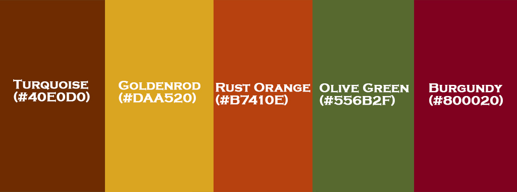
For those who crave the rich, cozy vibes of fall year-round, Autumn Harvest is perfect. The deep, earthy colors bring an inviting warmth to your space, making it feel like a cozy haven.
Rust Orange (#B7410E):
This color screams fall and is perfect for adding warmth to a living room or dining space.
Rust Orange works beautifully on accent walls or as part of textiles like throw blankets, pillows, or a cozy area rug.
Goldenrod (#DAA520):
Goldenrod is warm and inviting, like the last golden rays of sunlight on a crisp autumn afternoon.
It’s perfect for an accent wall, but also great for adding pops of color to accessories like vases, lamps, or curtains.
Burgundy (#800020):
This rich, dark red adds depth and sophistication. Think of using it for a dining room or library, where the deep hues can create a more intimate, elegant feel.
Burgundy pairs beautifully with lighter hues like Goldenrod or Olive Green.
Olive Green (#556B2F):
A versatile color, Olive Green brings nature into your home, creating an earthy atmosphere.
It can be used in both large and small doses—consider it for furniture, accent walls, or even indoor plants to infuse life into the room.
Chestnut Brown (#6E2C00):
Deep and grounded, Chestnut Brown can be used in furniture pieces, cabinetry, or as flooring.
It anchors the palette beautifully, giving balance and creating a cozy, grounded space.
4. Modern Neutrals
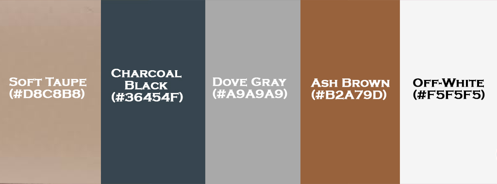
If you’re a fan of a minimalist, chic style, then Modern Neutrals will quickly become your go-to palette. This sophisticated blend of neutral tones creates a clean and calm environment, ideal for a contemporary home.
Soft Taupe (#D8C8B8):
This gentle neutral creates a relaxed atmosphere, making it perfect for large spaces like living rooms or bedrooms.
Use it for walls, sofas, or even flooring to establish a calming environment.
Dove Gray (#A9A9A9):
Gray is timeless and works in almost any space. Dove Gray is ideal for furniture, especially if you want a cool, sleek feel.
It pairs beautifully with Soft Taupe for a seamless look.
Charcoal Black (#36454F):
Deep, dramatic, and sophisticated, Charcoal Black adds a level of luxury to your decor.
Consider it for accent walls, cabinetry, or smaller elements like mirrors and frames.
Off-White (#F5F5F5):
The perfect backdrop, Off-White works beautifully for ceilings, trim, and walls.
It keeps the space feeling light while still feeling grounded.
Ash Brown (#B2A79D):
This soft brown adds warmth and balance to the otherwise cool tones of the palette.
It’s great for furniture, wood accents, or textiles like rugs and throws.
5. Coastal Breeze
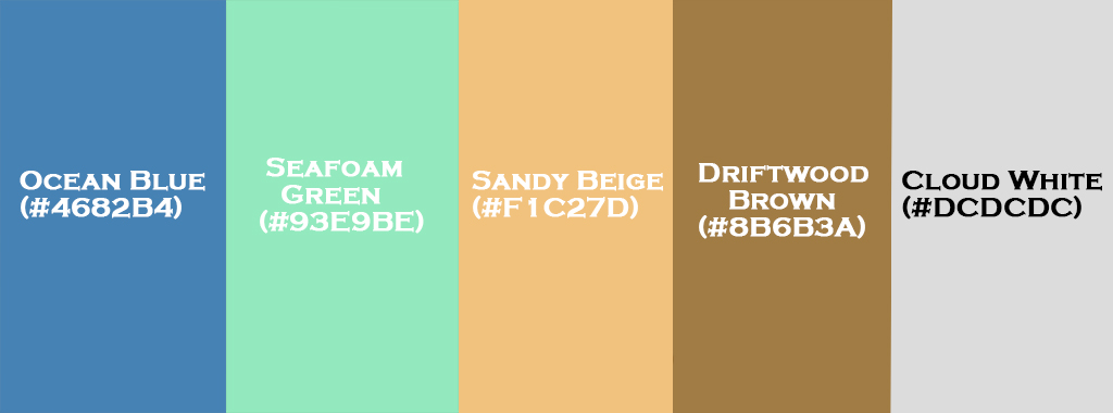
Bring the serene and breezy vibes of the coast into your home with Coastal Breeze. This palette offers refreshing, light colors that remind you of salty air and sandy beaches.
Seafoam Green (#93E9BE):
This cool, calming color can be used in your bathroom for a spa-like atmosphere or in the bedroom to create a serene retreat.
Pair it with whites or neutral shades for a soft, breezy look.
Sandy Beige (#F1C27D):
Perfect for adding warmth to the space, Sandy Beige can be used for furniture, walls, or area rugs to create a soothing and cozy atmosphere.
Ocean Blue (#4682B4):
A versatile and refreshing blue, Ocean Blue is great for accent walls, fabrics, or accessories like throw pillows or artwork.
It’ll remind you of the sea every time you walk into the room.
Driftwood Brown (#8B6B3A):
Earthy and grounding, Driftwood Brown adds a touch of natural elegance.
Use it for furniture, shelving, or framed artwork to bring in some texture and organic warmth.
Cloud White (#DCDCDC):
Clean and bright, Cloud White makes the perfect backdrop for the other colors in this palette.
It works beautifully for walls, trim, or larger furniture pieces to keep the space feeling open and airy.
6. Bold and Bright
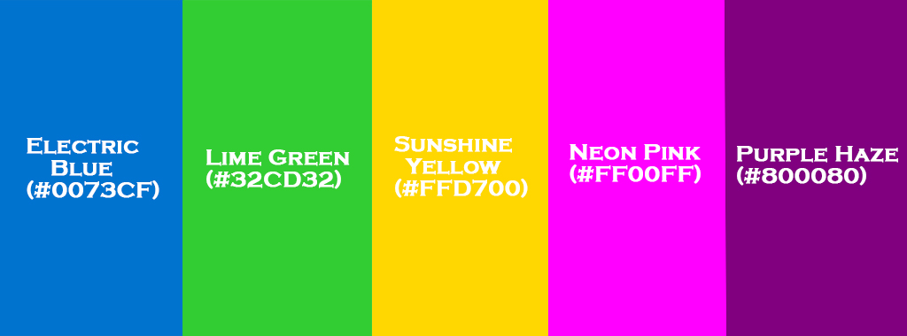
For those who love vibrant, daring colors, Bold and Bright is the palette for you. It’s all about making a statement, infusing energy, and adding a pop of excitement to your space.
Electric Blue (#0073CF):
This bold, electric hue is perfect for creating a dramatic impact.
Use it for an accent wall in a living room or bedroom, or incorporate it into accessories like lamps, vases, or even throw pillows.
Neon Pink (#FF00FF):
Neon Pink is playful and exciting. It’s great for adding flair to smaller décor pieces like art, cushions, or picture frames.
Don’t be afraid to go bold here—Neon Pink works best when you mix it with darker neutrals or softer pastels.
Sunshine Yellow (#FFD700):
Bright, cheerful, and warm, Sunshine Yellow is perfect for kitchens or dining areas where you want to add a cheerful, sunny vibe.
Consider it for accent walls, counter stools, or even dishware.
Lime Green (#32CD32):
Fresh and zesty, Lime Green is perfect for bringing life into a room. Consider it for throw pillows, art prints, or even an accent chair.
It adds a bit of fun and playfulness to any space.
Purple Haze (#800080):
Purple Haze brings an air of mystery and sophistication. It’s perfect for creating a luxurious, dramatic feel.
You can use it for upholstery on furniture or as an accent color for drapes or rugs. Pair it with gold or silver accents for a truly regal look.
7. Bohemian Chic
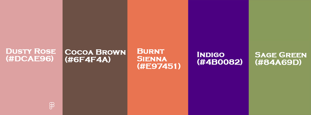
The Bohemian Chic palette is perfect for anyone who loves rich, earthy tones and an eclectic, laid-back vibe. This collection of colors brings warmth and personality into any room, combining vintage and natural elements.
Burnt Sienna (#E97451):
This earthy, reddish-brown color creates a cozy atmosphere in living rooms or bedrooms.
Use it on furniture, accent walls, or in woven textiles like rugs and throws for a warm, inviting feel.
Cocoa Brown (#6F4F4A):
A rich, chocolatey hue, Cocoa Brown can be used to anchor the room. Try it in larger pieces like sofas, coffee tables, or wooden accents.
It pairs well with the warmer tones in this palette, like Dusty Rose and Burnt Sienna.
Dusty Rose (#DCAE96):
Soft and romantic, Dusty Rose works beautifully in bedrooms or living rooms. Think soft velvet cushions, bed linens, or even a statement armchair.
It has a vintage, timeless charm that adds an elegant touch.
Sage Green (#84A69D):
Calm and soothing, Sage Green is perfect for areas where relaxation is key, such as bedrooms or reading nooks.
You can use it for walls, furniture, or textiles like curtains and throws. It pairs wonderfully with the warmer tones of Dusty Rose and Burnt Sienna.
Indigo (#4B0082):
Deep and rich, Indigo adds a touch of mystery and sophistication. Use it in accent pieces, like throw blankets, decorative pillows, or even a bold accent wall.
Pair it with brass or gold fixtures for added warmth.
8. Vintage Romance
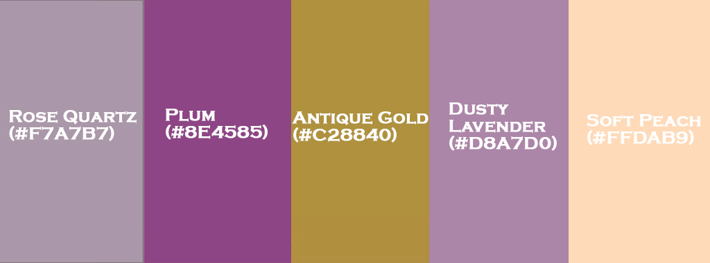
The Vintage Romance palette is for those who love soft, nostalgic colors with timeless elegance. It’s all about creating a romantic and classic atmosphere, whether you’re updating a bedroom or transforming a living room.
Rose Quartz (#F7A7B7):
Soft and gentle, Rose Quartz is a perfect color for creating a romantic, feminine vibe.
It works beautifully for walls, throw pillows, or bedding. It’s ideal for bedrooms or living rooms where you want to add a soft, loving touch.
Dusty Lavender (#D8A7D0):
Romantic and dreamy, Dusty Lavender adds a delicate, vintage touch to any room. Try it on accent walls or as part of your furniture, such as an upholstered chair.
It pairs effortlessly with the gentle tones of Rose Quartz and Antique Gold.
Antique Gold (#C28840):
Antique Gold adds a touch of luxury and nostalgia. Consider using it for light fixtures, frames, or other decorative accents.
It brings a classic and warm look to the space, especially when paired with the soft colors of Rose Quartz and Dusty Lavender.
Soft Peach (#FFDAB9):
Light and warm, Soft Peach creates a cozy and inviting feel. Use it for accent pillows, bedding, or even as a light wall color.
It works wonderfully in living rooms or bedrooms, adding a subtle warmth to the overall design.
Plum (#8E4585):
Deep and rich, Plum adds depth and elegance. Consider it for smaller décor pieces like throw blankets, curtains, or accent chairs.
It brings a sense of sophistication while complementing the softer, lighter shades in the palette.
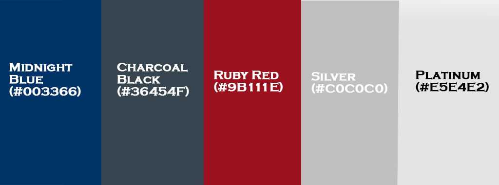
9. Midnight Luxe
For those who love the allure of deep, rich tones and a touch of glamour, Midnight Luxe is the perfect palette. It’s all about creating an elegant, sophisticated space with a modern yet timeless feel.
Midnight Blue (#003366):
Deep and dramatic, Midnight Blue is ideal for accent walls, bedrooms, or statement pieces of furniture.
It brings a cool, calm vibe while also evoking luxury and elegance.
Silver (#C0C0C0):
Silver is sleek, modern, and sophisticated. Use it for metallic accents like light fixtures, frames, or furniture legs to add a touch of luxury without being too overbearing.
Ruby Red (#9B111E):
Rich and striking, Ruby Red brings warmth and boldness to the palette. Use it sparingly for accent furniture, artwork, or decorative accessories.
It pairs beautifully with the cool tones of Midnight Blue and the metallic accents of Silver.
Charcoal Black (#36454F):
Charcoal Black grounds the palette and adds sophistication. Consider it for statement pieces like upholstered furniture, or accent walls, or as a backdrop for lighter decor elements.
Platinum (#E5E4E2):
Platinum adds a soft shimmer and brightens up the overall palette. It’s perfect for light fixtures, furniture, or décor accents.
It pairs beautifully with Ruby Red for a luxurious touch.
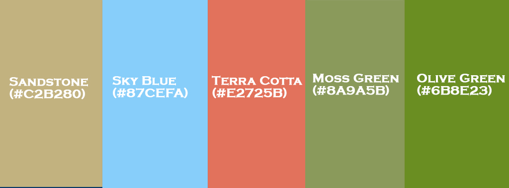
10. Earthy Escape
Last but not least, Earthy Escape brings you back to nature with its calming, organic tones. It’s all about creating a grounded, peaceful atmosphere, perfect for those who want to feel connected to the outdoors.
Olive Green (#6B8E23):
Olive Green is earthy and calming. It’s ideal for bedrooms, living rooms, or dining rooms where you want to evoke a connection to nature.
Try using it for accent walls, furniture, or even as part of your outdoor decor.
Terra Cotta (#E2725B):
Warm and rustic, Terra Cotta adds an inviting, earthy tone to any room. Use it for flooring, accent walls, or even as part of your kitchen cabinetry.
It pairs beautifully with Olive Green for a grounded, natural aesthetic.
Moss Green (#8A9A5B):
Moss Green is soft and organic. Consider using it for smaller decor pieces like throw pillows, curtains, or planters.
It’s great for creating a natural, calming vibe in any room.
Sandstone (#C2B280):
Soft and neutral, Sandstone works well for larger furniture pieces, walls, or floors.
It’s the perfect color for creating a natural, serene atmosphere and pairs beautifully with the other earthy tones in this palette.
Sky Blue (#87CEFA):
Sky Blue adds a refreshing, airy quality to this earthy palette.
Use it for accents, such as throw pillows or window treatments, or in larger areas like an accent wall to add a touch of calmness and serenity.
How to Use 70s Color Palettes in Modern Design
If you’re drawn to the bold, vibrant colors of the 70s but want to create a modern space, here’s how you can seamlessly integrate 70s color palettes into your home:
1. Balance with Minimalism
Use bold 70s hues like Coral or Turquoise as accent colors in a minimalist room. Think throw pillows or a statement sofa to let these colors pop.
2. Accent Walls
Create drama with colors like Goldenrod or Olive Green on an accent wall, pairing them with neutral furniture for a modern touch.
3. Blend with Natural Materials
Combine 70s shades like Olive Green and Terra Cotta with natural wood or woven pieces to capture that earthy retro vibe.
4. Color Blocking
Try color blocking with vibrant shades like Electric Blue and Neon Pink alongside minimalist furniture and natural light for an energetic, modern feel.
5. Revamp Vintage Furniture
Update vintage pieces with retro shades like Dusty Rose or Burnt Sienna to blend old-school charm with a contemporary edge.
6. Art & Accessories
Introduce 70s colors through smaller items like Rose Quartz or Turquoise artwork, cushions, or ceramics for a subtle retro touch.
7. Neutral Base with Bold Pops
Pair soft neutrals like Taupe and Off-White with bursts of 70s colors in accessories or artwork to keep the space modern yet nostalgic.
8. Bohemian Vibe
For a cozy, boho-inspired look, mix Burnt Sienna, Dusty Rose, and Sage Green for a modern take on retro style.
9. Retro Tiles in Kitchens/Bathrooms
Opt for Sky Blue or Turquoise tiles in kitchens or bathrooms for a fresh, retro touch with modern fixtures.
10. Retro Lighting
Use warm Amber or Goldenrod lighting fixtures to evoke 70s vibes, balanced with sleek, contemporary decor.
Conclusion
In conclusion, incorporating 70s color palettes into modern design can be a fun and creative way to breathe life into your home. Whether you’re adding vibrant accents with shades like Coral and Turquoise, or grounding your space with earthy tones like Olive Green and Burnt Sienna, the key is to strike a balance between retro energy and contemporary simplicity. By blending these iconic colors with modern furniture, natural materials, and thoughtful design choices, you can achieve a look that feels both nostalgic and fresh. So, embrace the boldness of the 70s and let it inspire your next home makeover!
FAQs
Why should I use 70s color palettes in modern design?
The 70s were an era of bold and expressive colors that evoked individuality and creativity. These palettes offer a unique blend of vintage charm and modern versatility. Incorporating them into your design adds warmth, nostalgia, and a touch of personality.
Can 70s color palettes work in contemporary spaces?
Absolutely! When paired with modern elements, 70s color palettes can create a timeless yet fresh look. Mixing earthy tones or vibrant accents with neutral backgrounds or contemporary furniture helps keep the design from feeling dated.
How can I use ’70s colors without overwhelming the space?
Start by using 70s colors as accent tones. This allows you to bring in their energy without overpowering the space. Additionally, balance them with neutral shades like white, gray, or black to maintain harmony.
Are there any tips for blending ’70s colors with current trends?
Pair 70s colors with modern typography and sleek design elements. Color blocking, geometric patterns, or mixing textures is a great way to give a nod to the 70s while keeping it contemporary.
Which 70s color palettes work best for interior design?
Palettes like Earthy Autumn with warm hues or Sunbaked Desert with muted tones are perfect for creating cozy, inviting spaces. These can be paired with modern furniture or bohemian décor to create a balanced and timeless room.
Can I use ’70s colors for a minimalist design?
Yes, you can! Choose one or two bold colors from the 70s and use them sparingly. A single avocado green accent chair or a retro light fixture in tangerine orange can add a pop of nostalgia without taking away from a minimalist aesthetic.
What types of design projects are 70s color palettes best suited for?
These color palettes work well in various fields—whether it’s for graphic design, interior décor, or fashion. They’re particularly great for projects aiming for a nostalgic, retro, or bohemian vibe.
How do I avoid making my design look too retro?
Keep it balanced by mixing ’70s colors with modern elements. For instance, use sleek, contemporary furniture or clean fonts alongside the bold hues of the 70s. This helps avoid an entirely vintage look while still embracing the vibrant tones.
Can 70s color palettes work for digital design?
Definitely! 70s-inspired colors can add a unique flair to web design. Use them for buttons, hover effects, or graphic elements to bring personality and boldness to a modern website.